In early 2018, Topia (formerly Move Guides) acquired Polaris Global Mobility, a 19 year old software company located in Bellevue Washington. While a competitor to Topia, Polaris had several areas of improved product functionality. After several months of investigation, the product team decided to migrate our product stack to the Polaris infrastructure. I led the design activities that integrated product functionality, and represented a massive leap forward in product experience.
Below are screenshots of the pre-existing Polaris products, as well as designs for the current platform. I have broken the content into sections with a short description of the problems we needed to solve through the product experience. Please note that Polaris screenshots include some very light rebranding to the Topia brand palette. Also, my team were the first to ever look at the Polaris product from a design perspective, as they had no designers or product managers in the previous 19 years (ouch!).
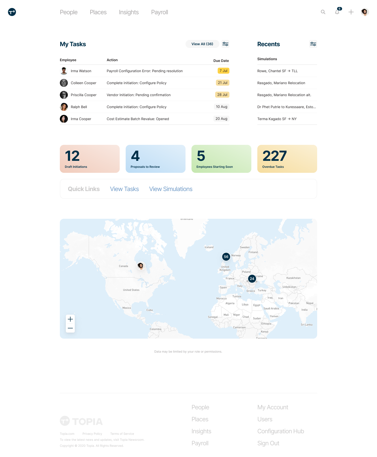
Dashboard
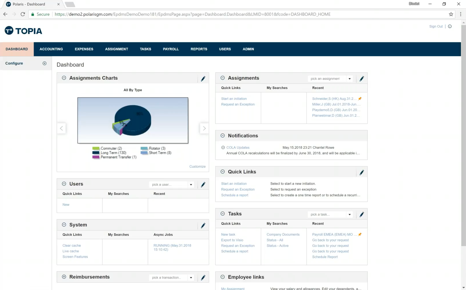
The Polaris dashboard left much to be desired from an experience perspective. It was cluttered and "highly customizable" (meaning low on product opinion), without a clear area of focus. Many of the available widgets were useless, or required heavy user customization to be functional. We took similar actions to the Move Guides dashboard and focused heavily on "curating user focus" and increasing data transparency. We no longer offer customization at the individual level, however there are some changes possible at the organization level.
Another massive improvement was the addition of global search. Navigating to an employee view in Polaris was very cumbersome, and through our new search experience we massively increased user efficiency.
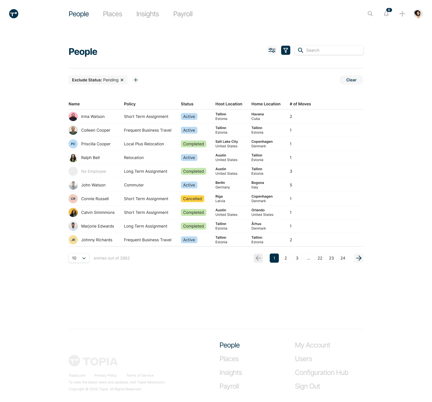
Employee List
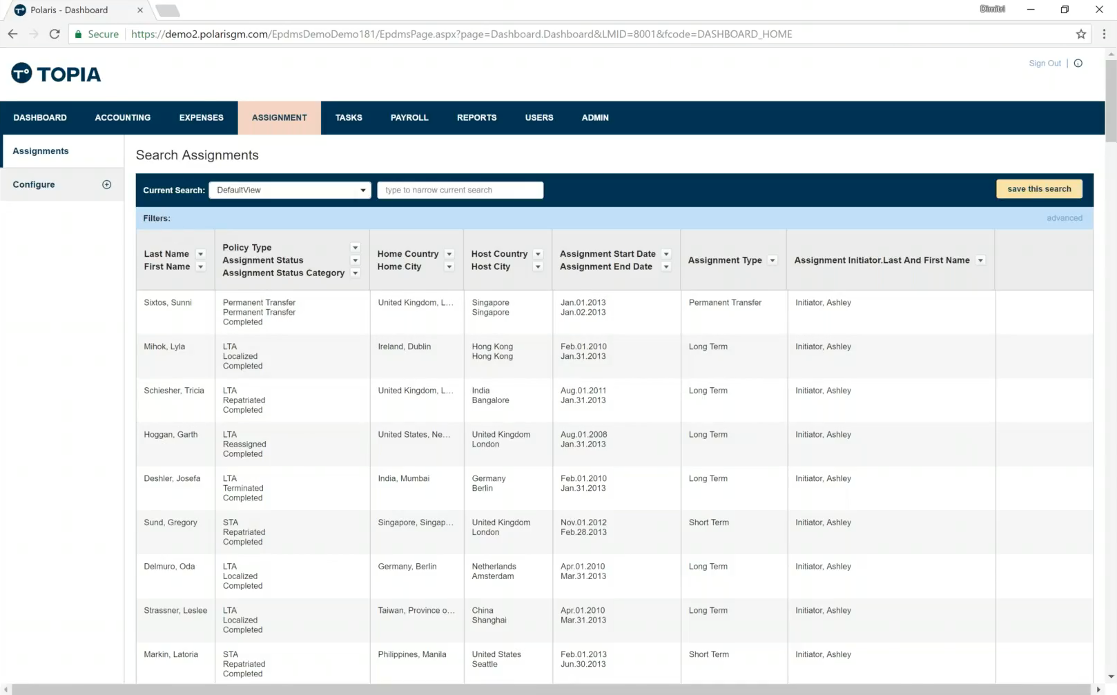
One of the major paradigm shifts I drove was focusing less on the tactical view of an "Assignment" and shift to holistically viewing the employee. We reorganized navigation to encompass the people and places your organization serves. We also overhauled the filter/column organization experience to something much more modern, as information density was a big issue throughout the legacy Polaris system.
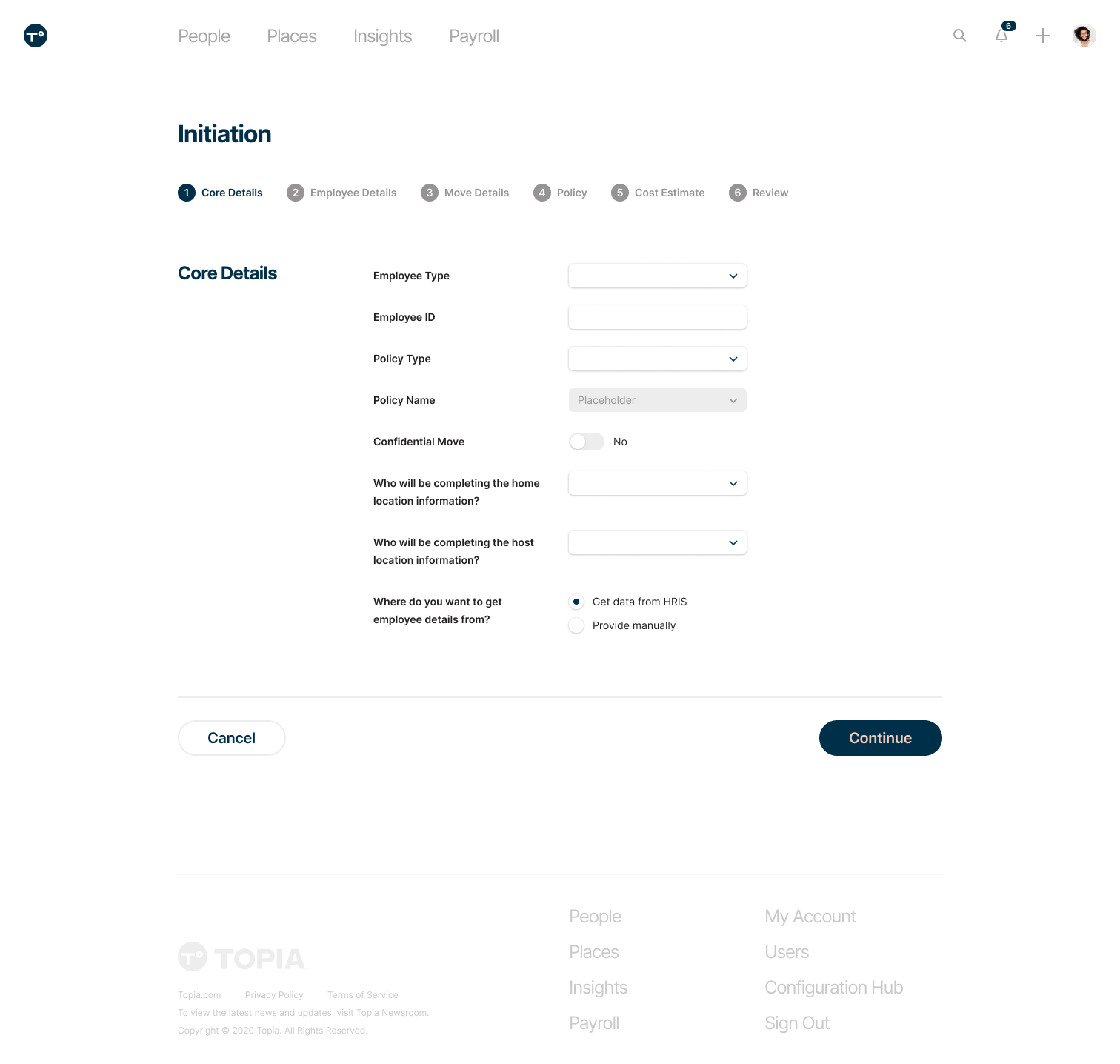
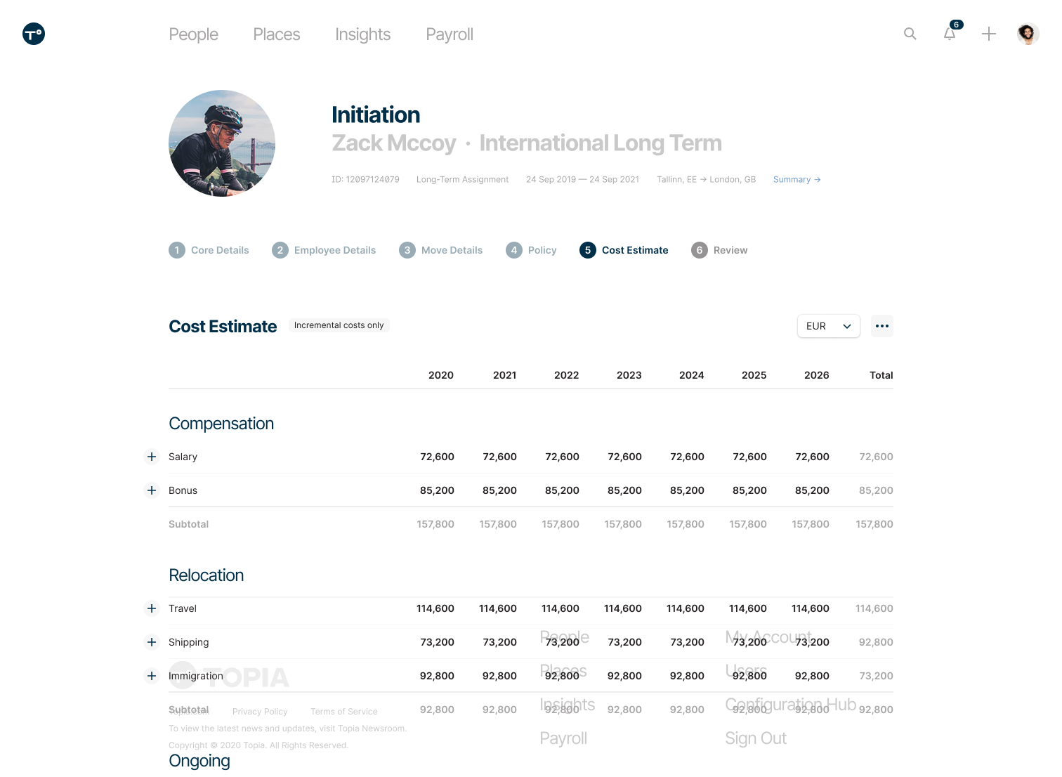
Initiation
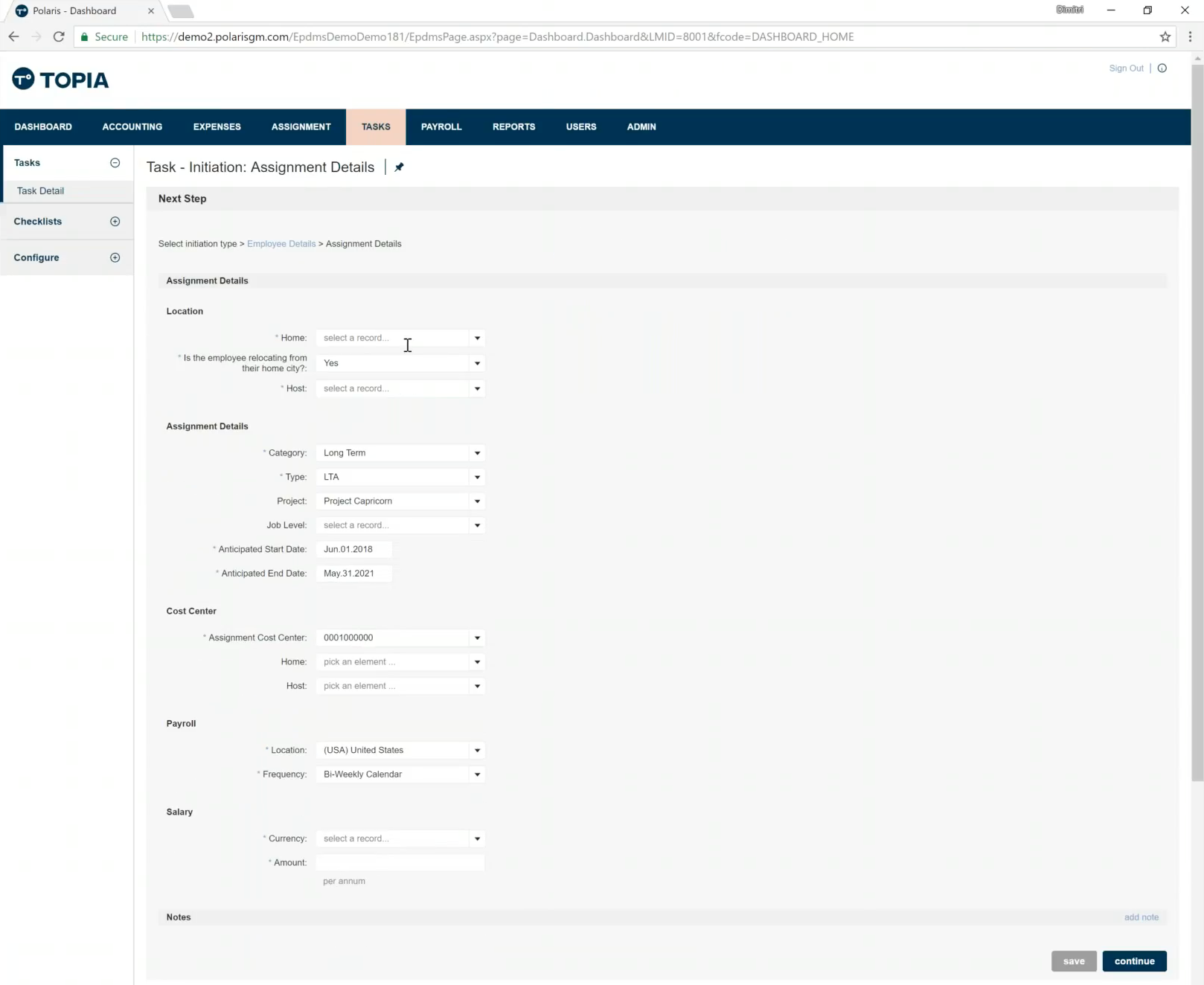
One of the most important user flows is "initiating" employees for relocation or work travel. Polaris had a clunky, multi-step flow that had no transparency around how many steps remained. There were also significant issues with system lag between steps, resulting in a flow that often took 30 minutes to complete. Through the integration we standardized the steps, allowing a stepper to show how much remained. We also optimized the loading process, removing the lag and jittery loading experience that previously existed.
One tenant of the redesign was building an experience that was much more approachable to less sophisticated users. We wanted the initiation form to be approachable to talent team members who are relocating new hires, as well as people managers that are moving their team members around the world. Our UI designer Marke did an impressive job of delivering a clear, approachable interface.
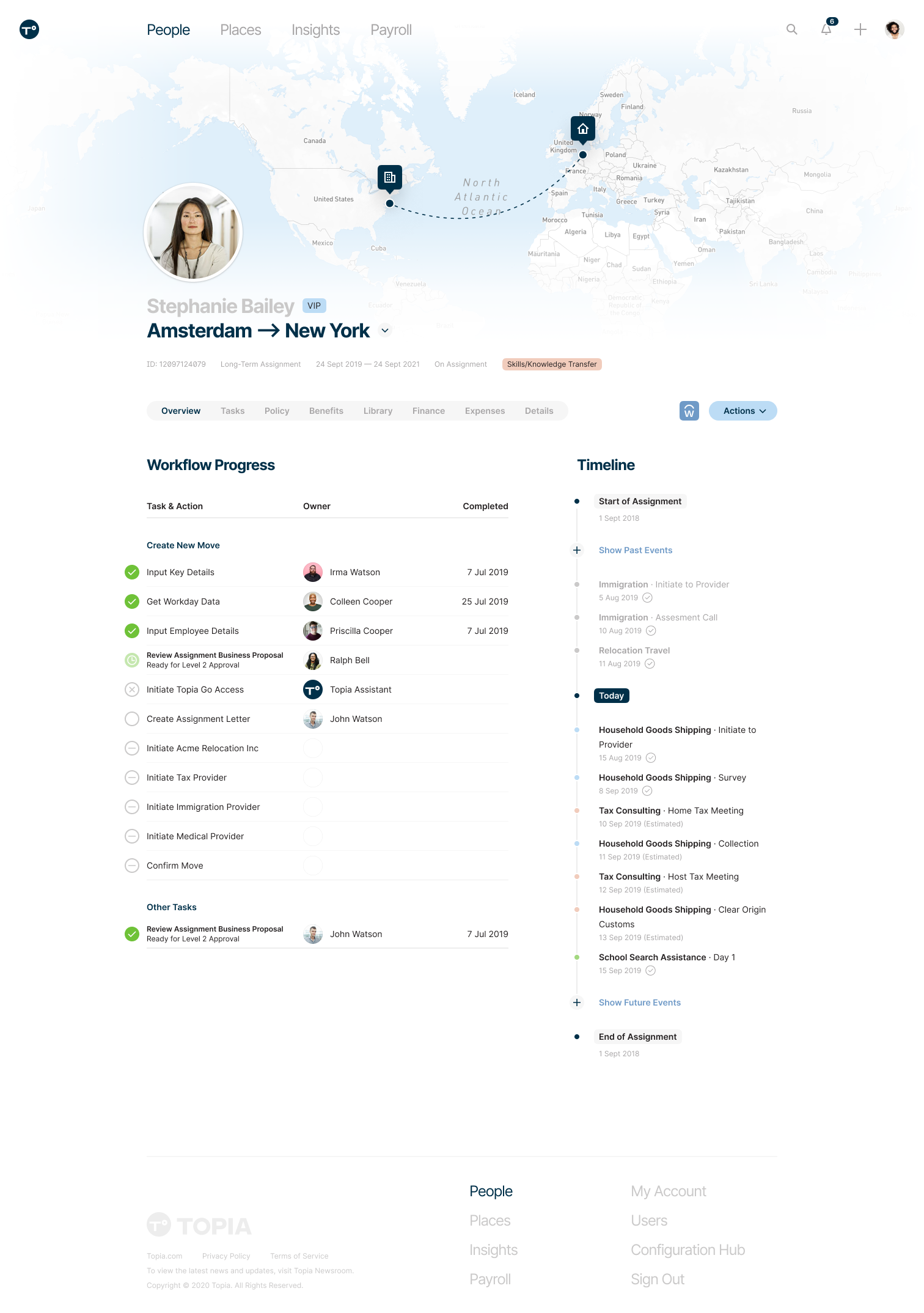
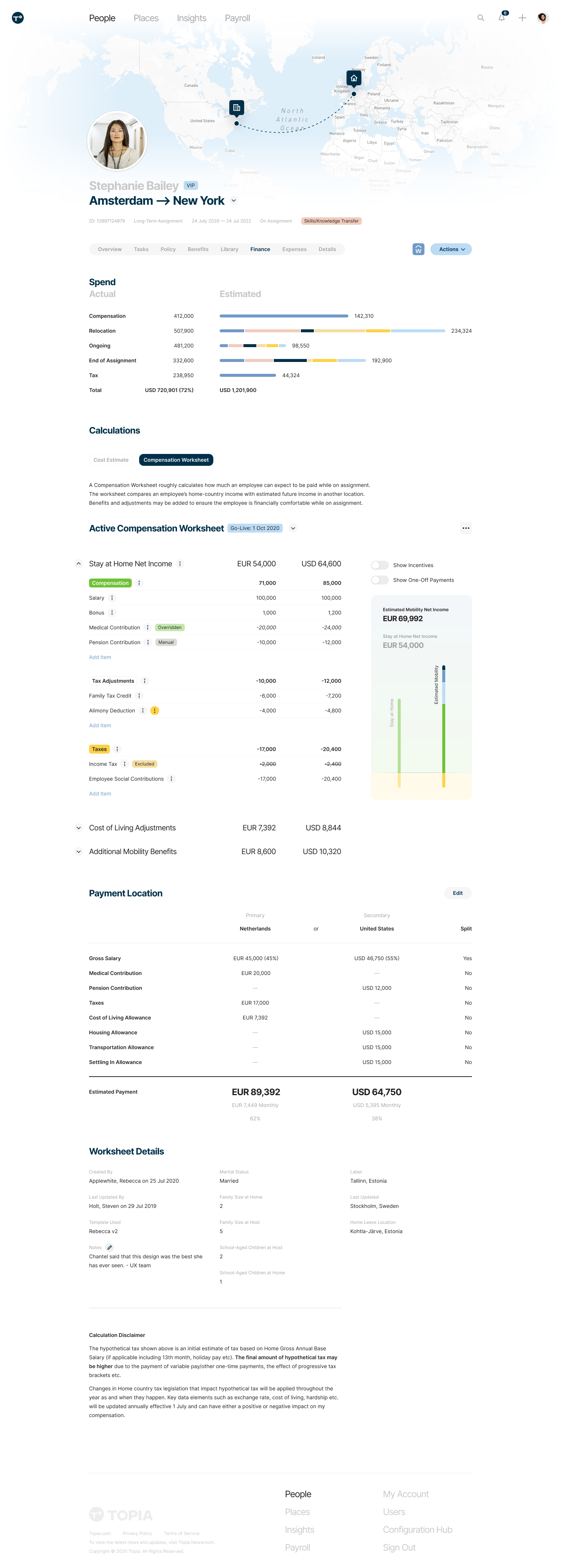
Move Overview
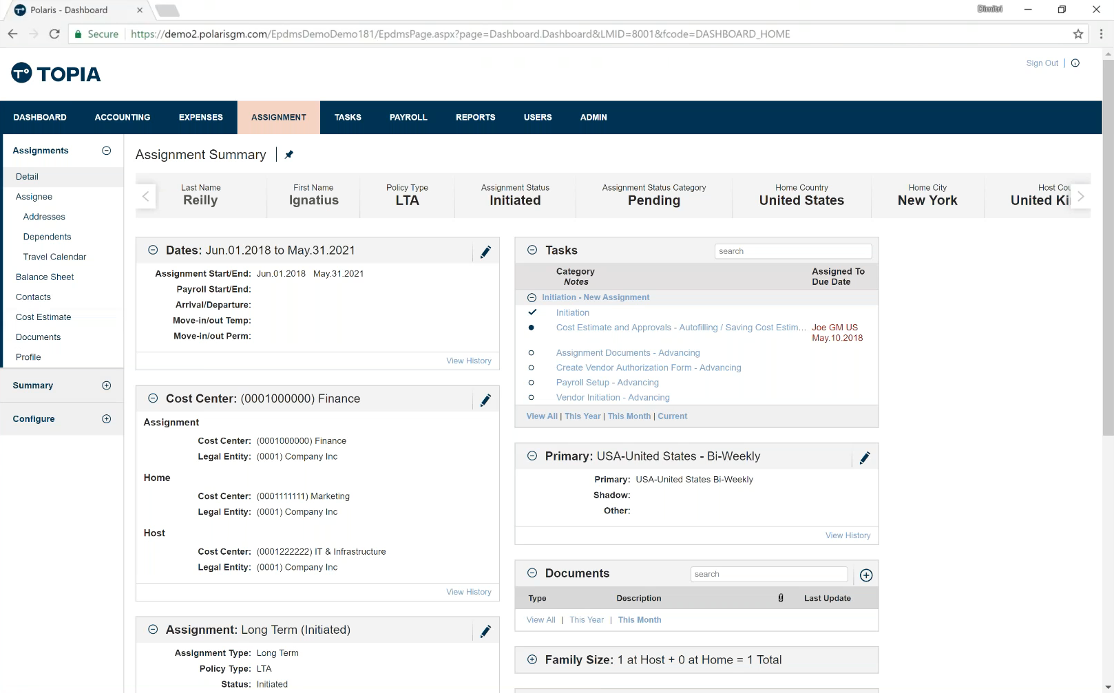
After an employee's relocation has been initiated, HR team members needed a way to track the progress of service delivery. They need to ensure things are on track, and quickly address any issues. The Polaris move view suffered from the same lack of perspective and overt customization as the dashboard. I focused on clear information hierarchy, alongside a more approachable UI design.
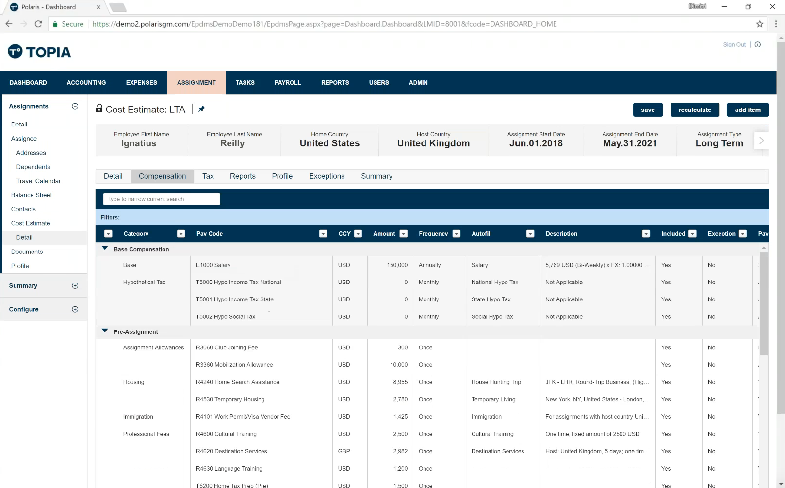
Cost Estimate
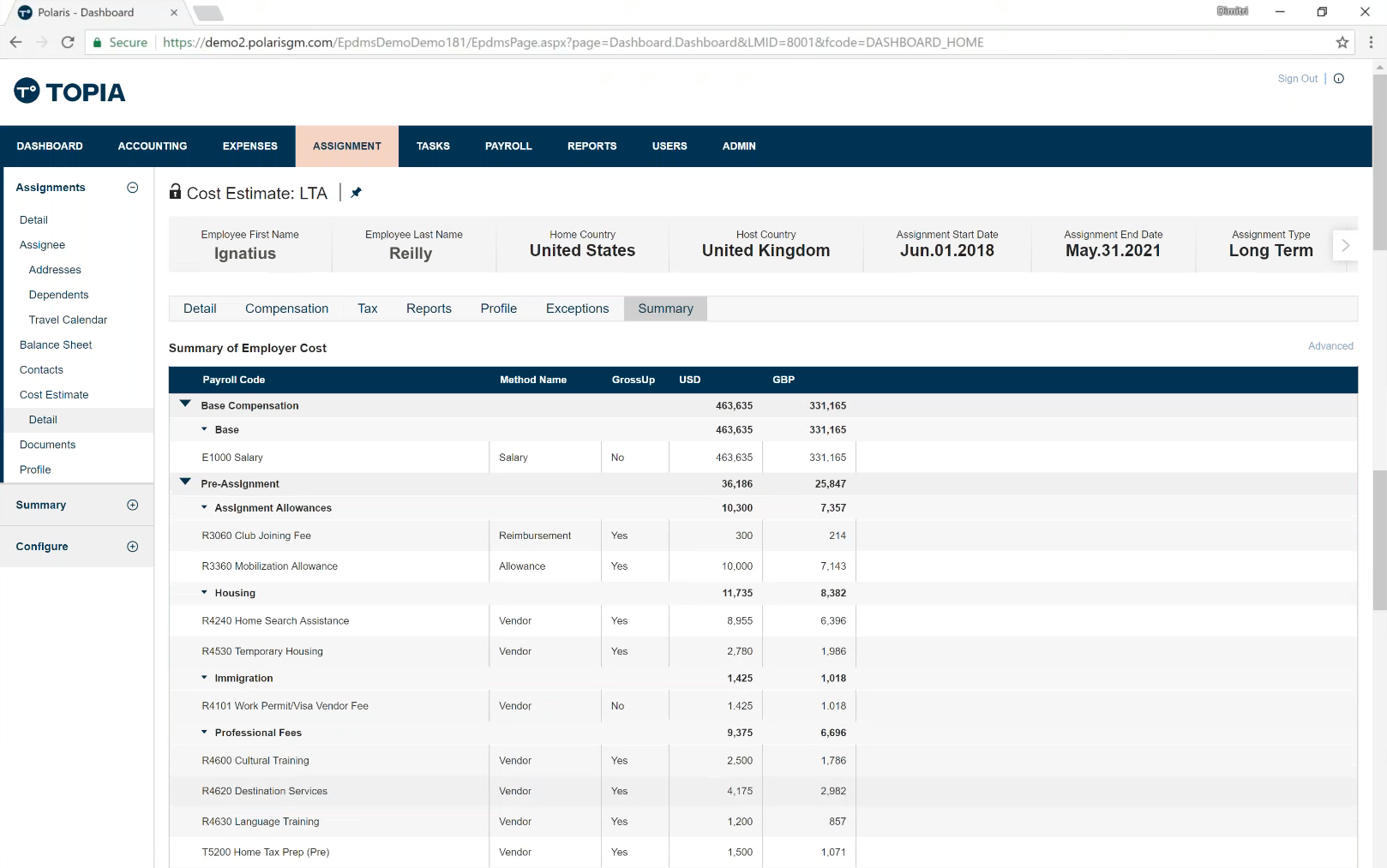
One of the biggest innovations Topia is bringing to the market is fast, dynamic cost estimates for relocation scenarios. Polaris had similar functionality, but it was slow to generate and cumbersome to use (right-click was required to navigate!). We spent lots of time refining the details for Topia's new cost estimate design. It is also substantially more performant, taking generation time from 10 minutes down to 1.
Compensation Worksheet
Another core innovation on our financial product offering is the compensation worksheet. Polaris had a bog-standard worksheet, and through the integration we were able to really focus on the user experience. We were heavily focused on facilitating a conversation between an HR expert and a relocating employee who is trying to understand the cost implications of moving. We have had great market response to this design and experience.
Process Artifacts
The images above skip a significant amount of the design process. Here are some artifacts of the process that show some of the intermediate states. The first collection is the output from a workshop I led with our CPO and head of sales (EMEA). We spent a week diving deep into the market opportunities we felt weren't being addressed, and came up with several novel (and often ridiculous) ideas.
After the workshop was complete, I created a long flow of wireframes that communicated the user journey we eventually wanted to create. This turned into our 3 year design vision, which I presented to the company and still referenced regularly years later.
This document contains a significant number of wireframes from throughout the design process. I work at this fidelity until I get sign off from PMs, so I don't waste cycles from my UI counterpart.