Upon joining Move Guides, I was immediately tasked with identifying current user friction, and chart a path forward for a full product overhaul. Move Guides had built several products and features over the previous 6 years, yet I was the first design hire in the company. I was excited by the opportunity to have a massive impact on the product, and to eventually build out the product design team.
Below I've illustrated two specific areas of product improvement. Please note we used the Google Material component library to streamline implementation.
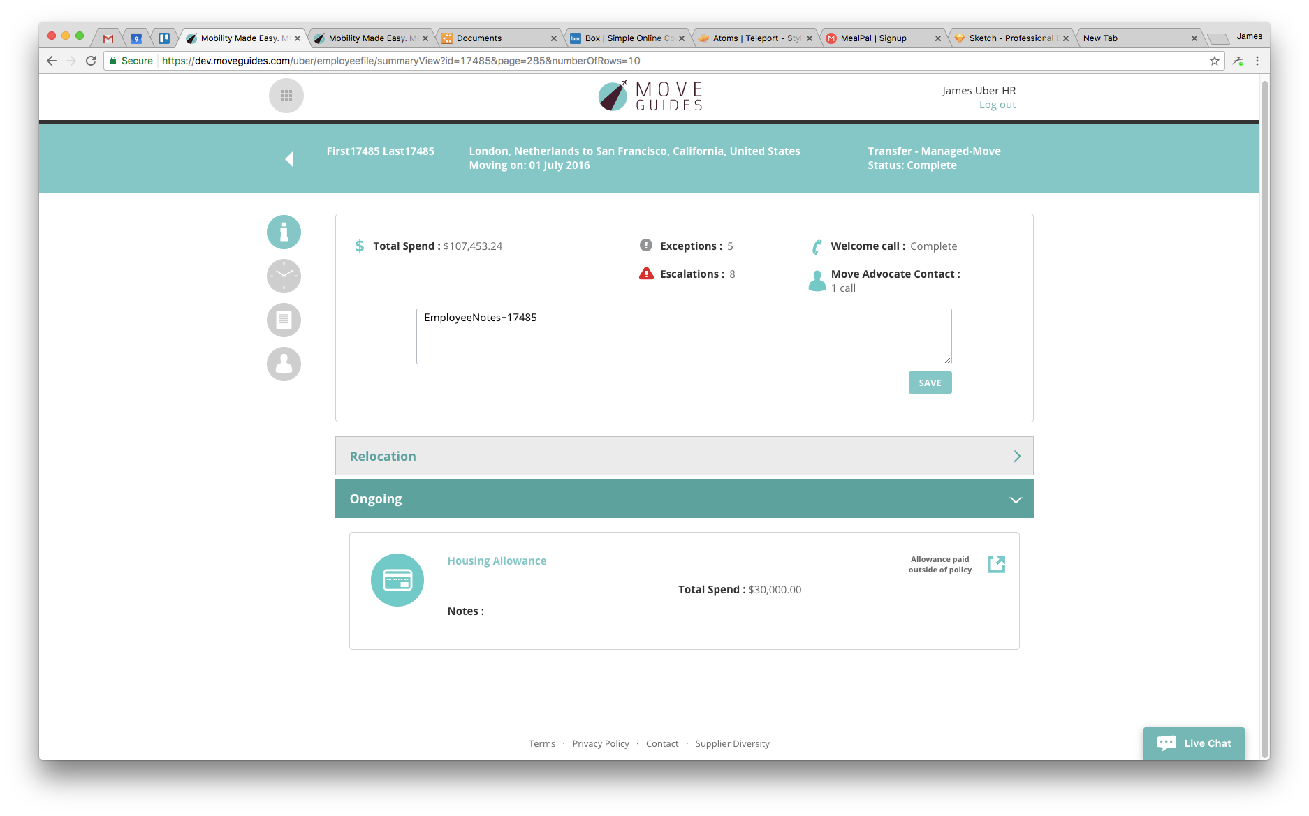
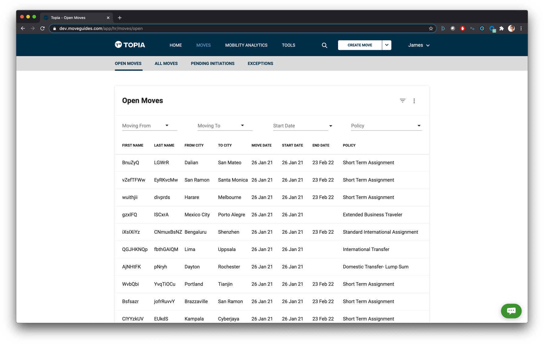
Dashboard
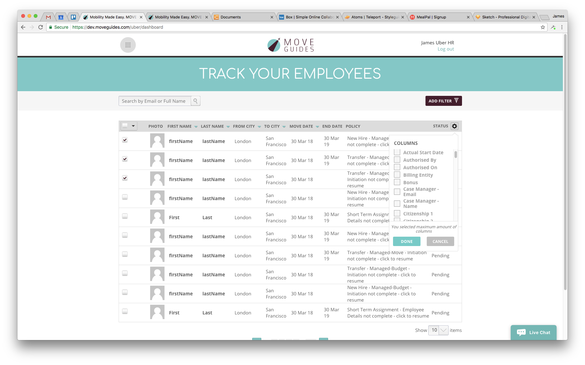
It became quickly apparent that we needed to overhaul the dashboard (aka home screen) to better direct our users. The existing app forced users to hunt for work to do, which lead to very poor user efficiency. I focused heavily on curating user focus towards the items that were most likely to need their attention.
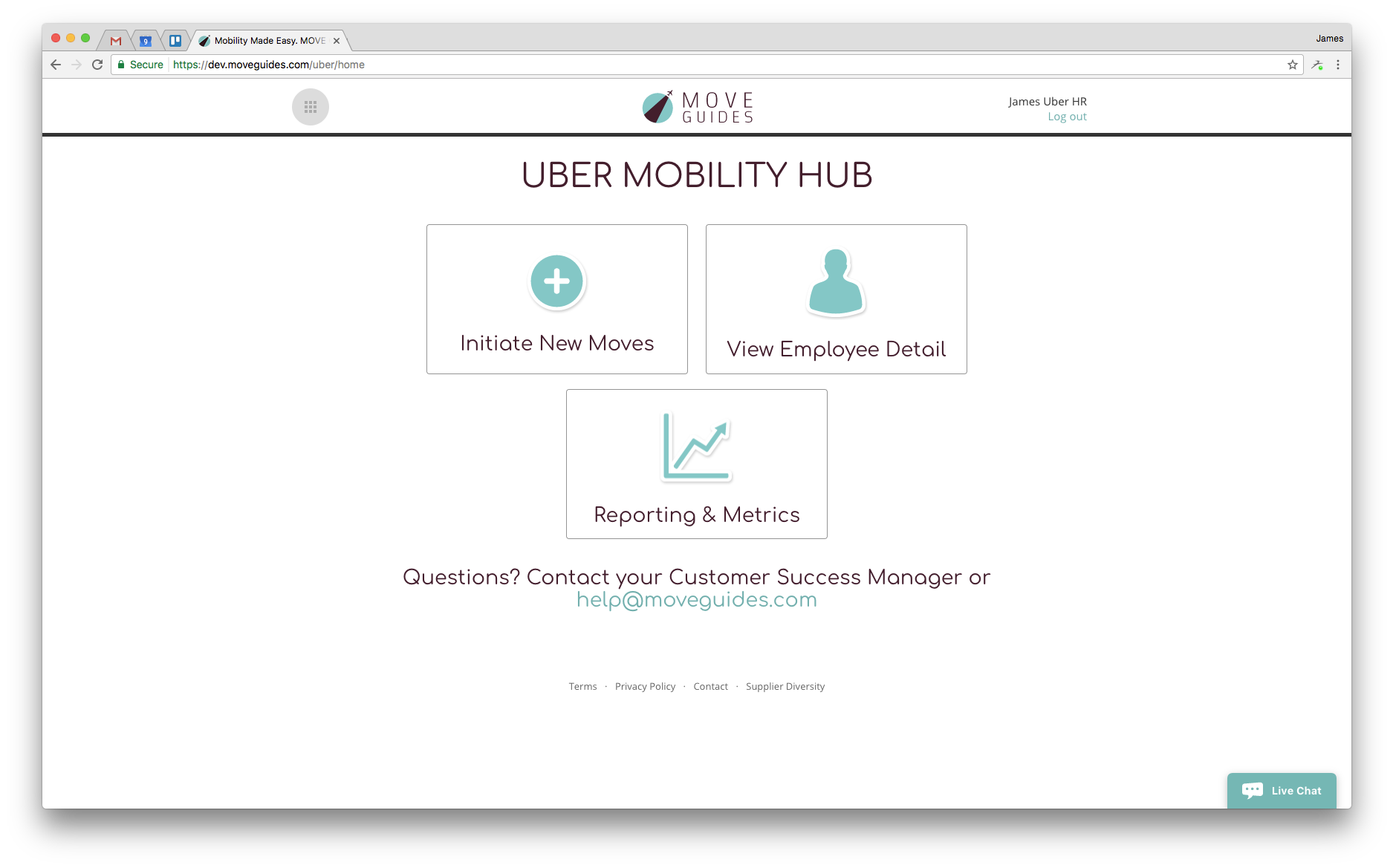
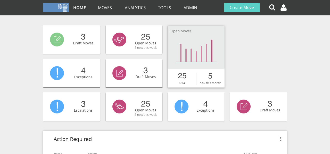
Existing Dashboard
As you can see, the utility of the three cards is quite low as there is no information transparency about what they contain. The navigation was also buried (and not actually functioning) up in the top corner, making it difficult to navigate and build a mental model of the tool's architecture.
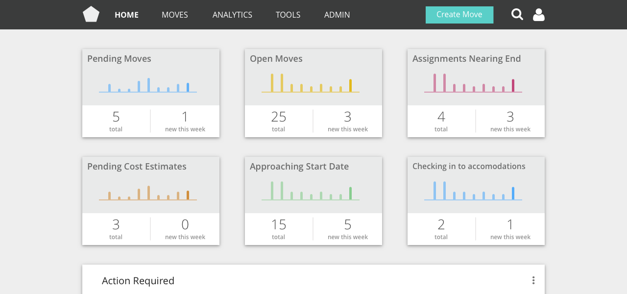
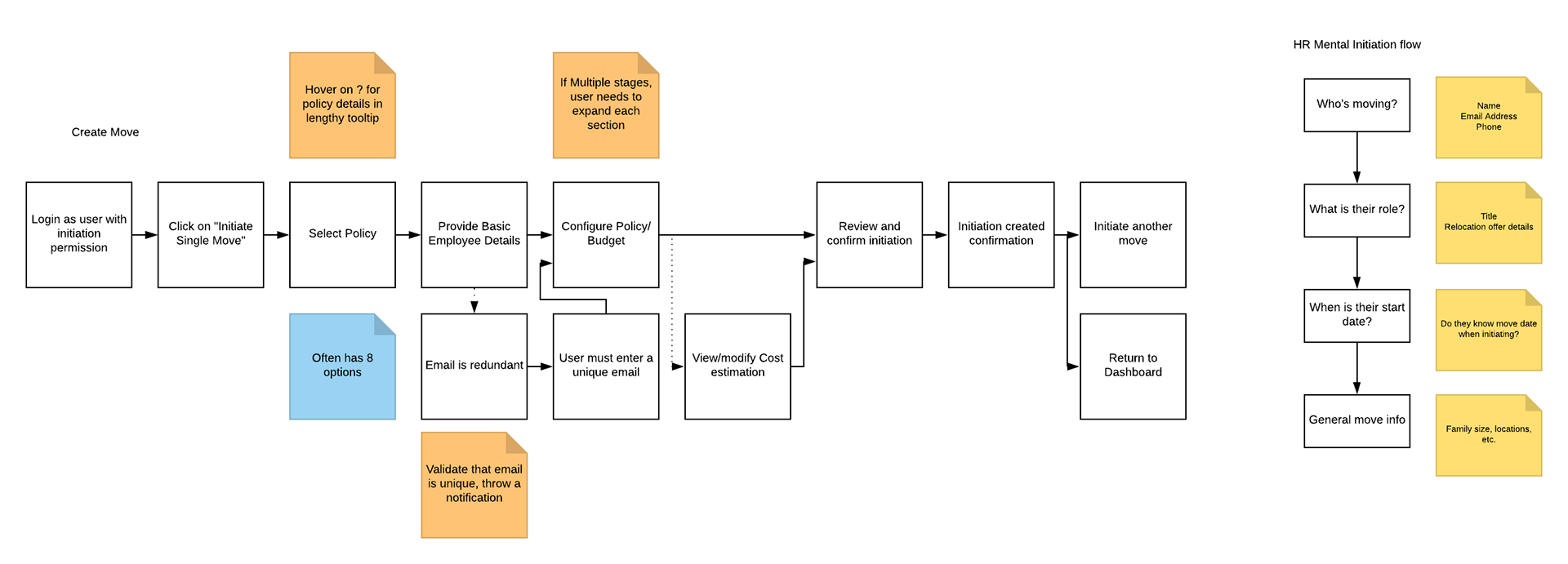
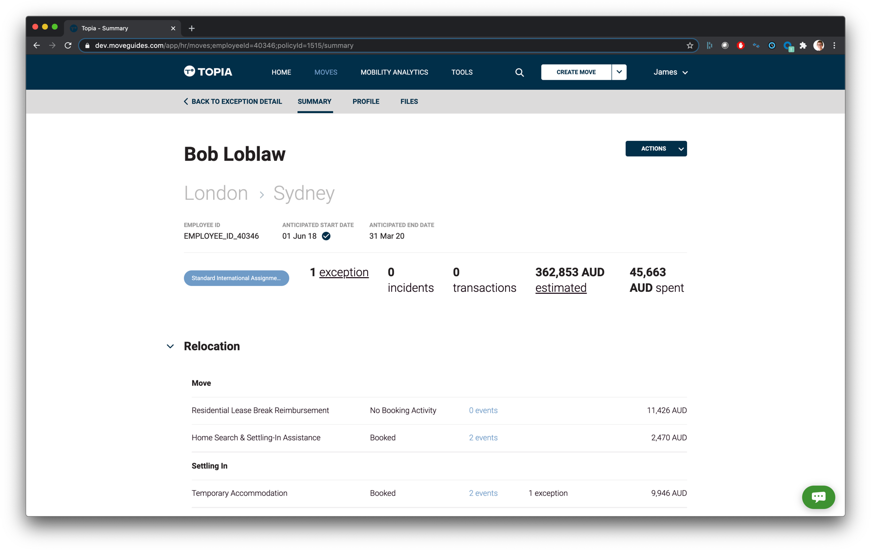
I focused on pulling information to the forefront, and to direct users towards tasks that needed attention. This began as the "Action Required" section on this process wireframe:
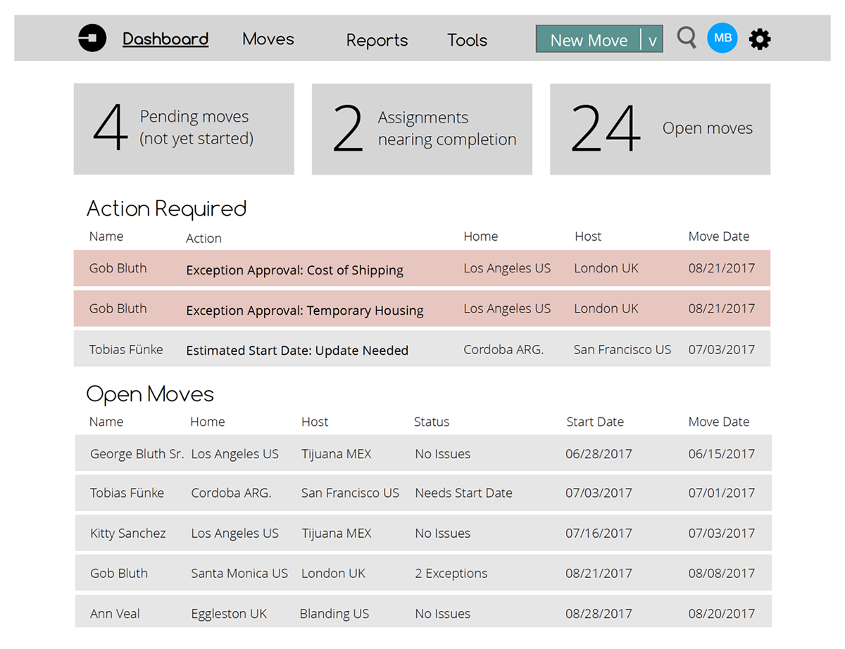
Process wireframe exploring data cards and Action Required section
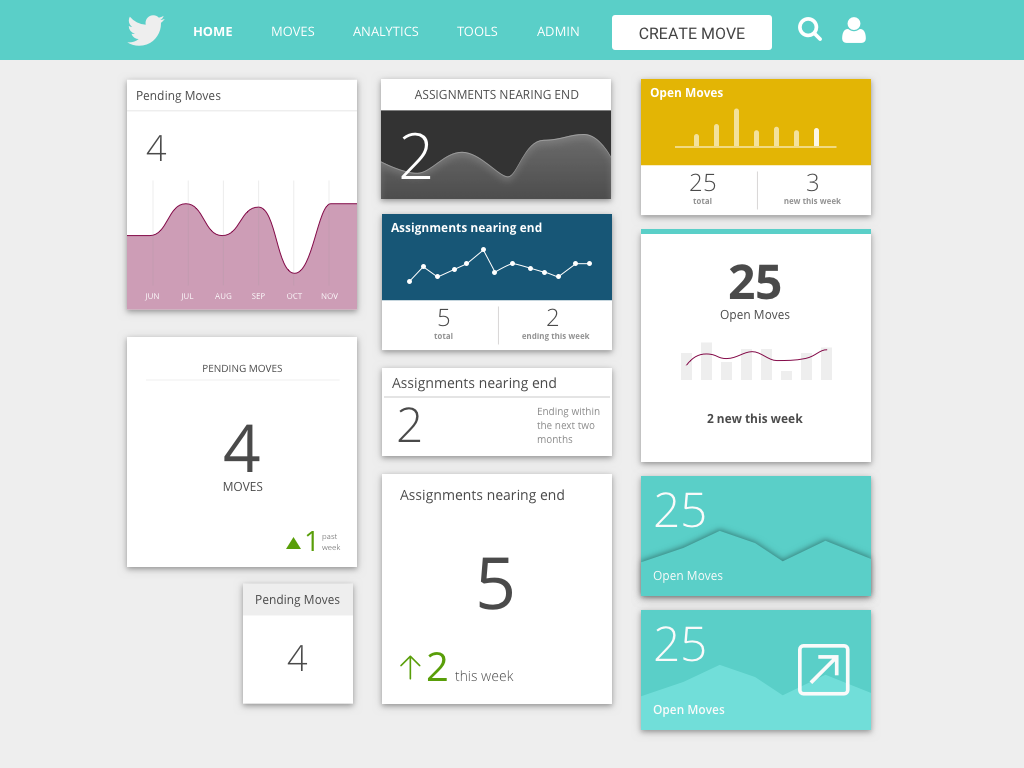
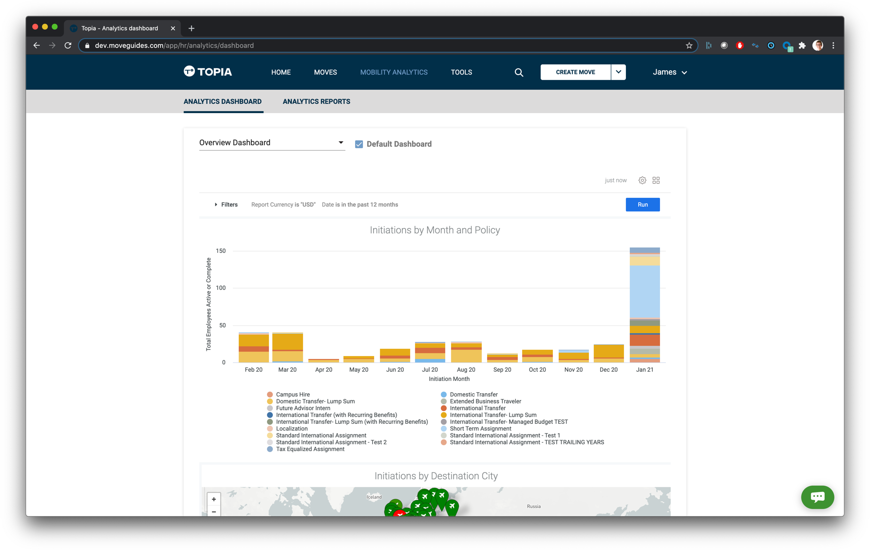
I also spent a good deal of time exploring ways to pull data forward that enabled insights and a fast way to narrow on a purposeful data subset. I explored several approaches for the data cards. Here are a few images of the process artifacts:
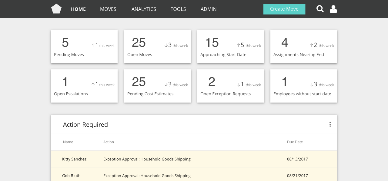
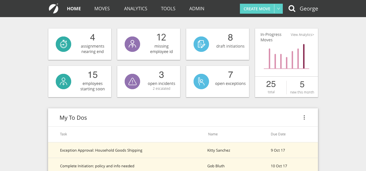
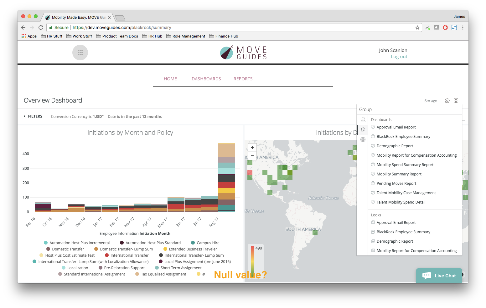
After several iterations with our engineers and further validation with customers we settled on a final design. It has performed very well with users and was met with enthusiasm upon launch.
Final version of the dashboard
Navigation
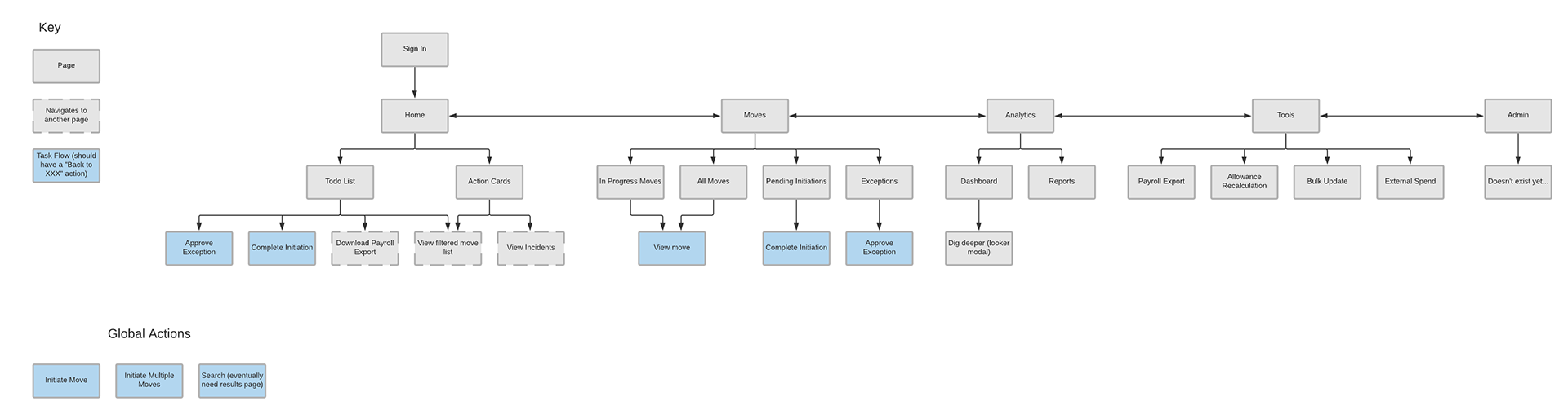
Another core challenge was to improve the navigation. The prior navigation was the product of kludging new functionality on wherever possible, without thought about the overall platform architecture. I began the navigation overhaul by documenting the current product architecture, which facilitated productive conversations with the Product Management team as we addressed what needed to change.
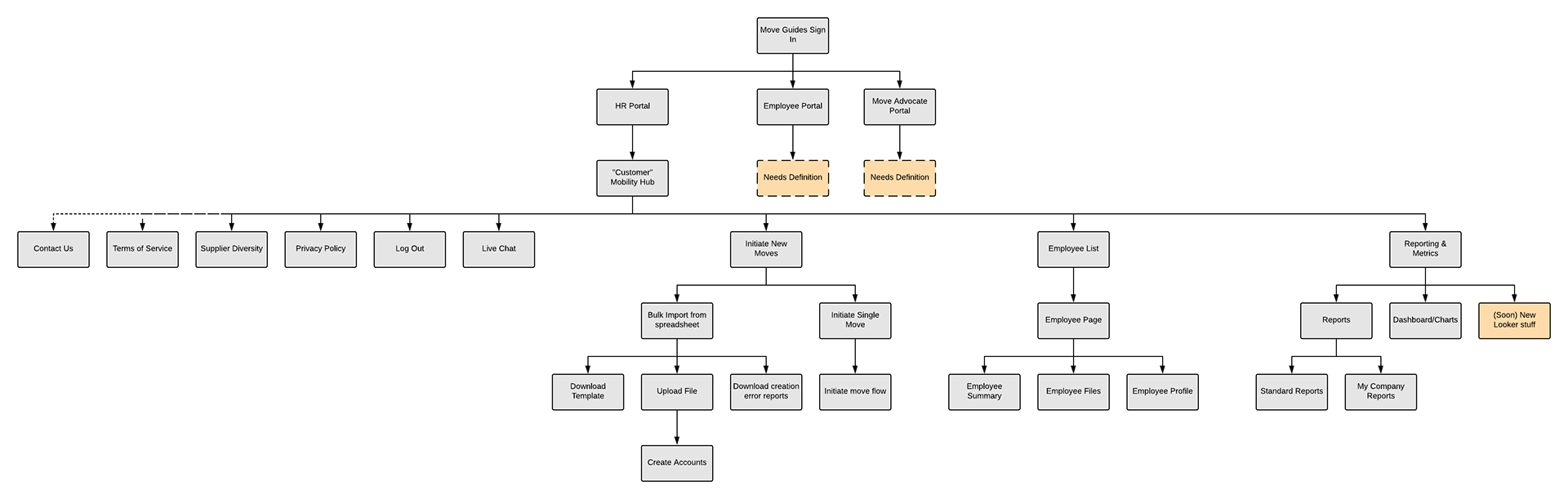
Pre-existing product architecture
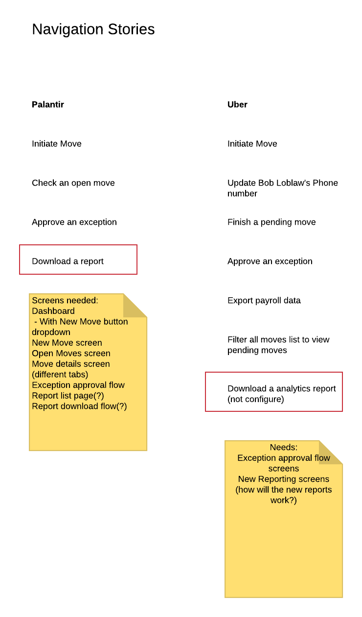
After documenting our pre-existing reality, I sourced numerous key user tasks, which I documented as user story maps. This helped me understand the core functionality and relative priorities for our distinct user personas. Here are a few examples:
After documenting the core product user stories, my focus shifted to creating a logical information architecture to accomodate our most important user flows. I focused specifically on making the platform "flatter", meaning you wouldn't have to drill through 6 layers to get to functionality which lowers cognitive load for users.
Improved platform architecture
After aligning everyone on the product team with the direction, I began exploring lots of different approaches for how we could handle the navigation. I prefer to work at low fidelity (hand drawn, keynote) for exploration, here are some of the keynote options I explored:
After further validation with product users, we refined the wireframes and settled on this design:
After completing the wireframes and getting sign-off from the PM and Engineering owners, I worked with my UI design team-mate and produced final mockups of the navigation. We made significant progress in the year we worked on this project, and I'm very proud of the outcome. Below are some "before and after" comparison images.
Before
After
Process Sketches
I prefer to work through core user flows in low-fidelity formats. Paper and pencil are ideal for in-person ideation, below are several samples of my product sketches.