TL;DR - I led design efforts to overhaul the user experience on MuleSoft’s flagship developer tool.

Background
Back in 2011, MuleSoft was beginning to encounter friction reaching new developer audiences with the flagship product, Mule ESB. Mule ESB was a sophisticated piece of software that could revolutionize the software integration world, but lacked an approachable interface.

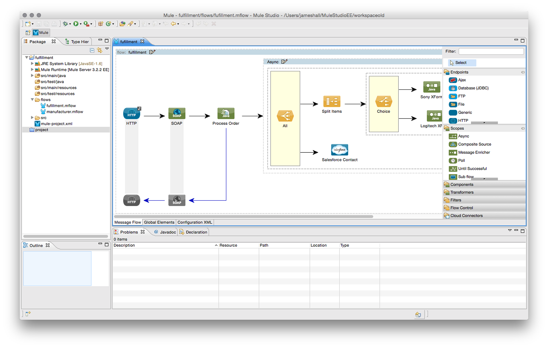
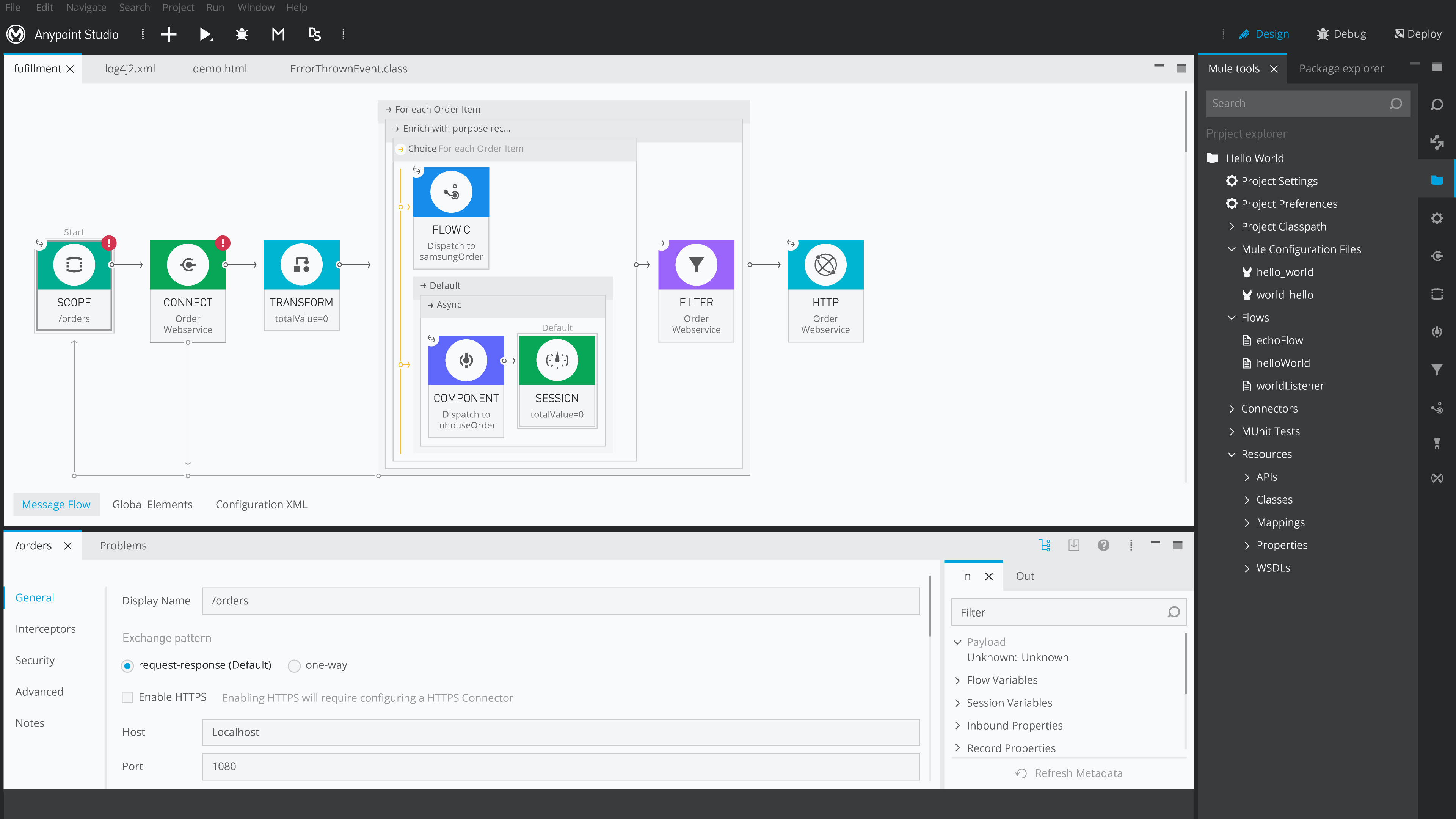
Mule ESB application in Eclipse
MuleSoft’s answer was to create “Mule Studio”. Studio’s initial purpose was to provide developers with an approachable way of beginning Mule application development, after which developers will transition to their IDE of choice. Two years of development passed, over which Studio’s mandate to “drive adoption” rapidly shifted to “be the place where developers can do anything they want with Mule ESB”. Functionality expanded from an XML editing tool to a drag-and-drop editor that removed the necessity of interacting with the XML.
Mule Studio: 2012
Phase 1 - Identify Friction
After spending some time with the product and learning more about the software integration space, I started performing user tests in Studio. I began testing with three distinct groups: current customers, internal experts, and java developers with no Mule experience.
I ran the full testing process including recruiting, creating tests, facilitating tests, and broadcasting the results. We learned a great deal through our tests, which led to a number of quick wins, and also laid the foundation for the larger studio enhancements in the future.
My favorite user testing insight was identifying a big issue with a default configuration state. Software integrations consist of connections and logic, and every time a user attempted to create a new connection our default configuration had a preselected operation.
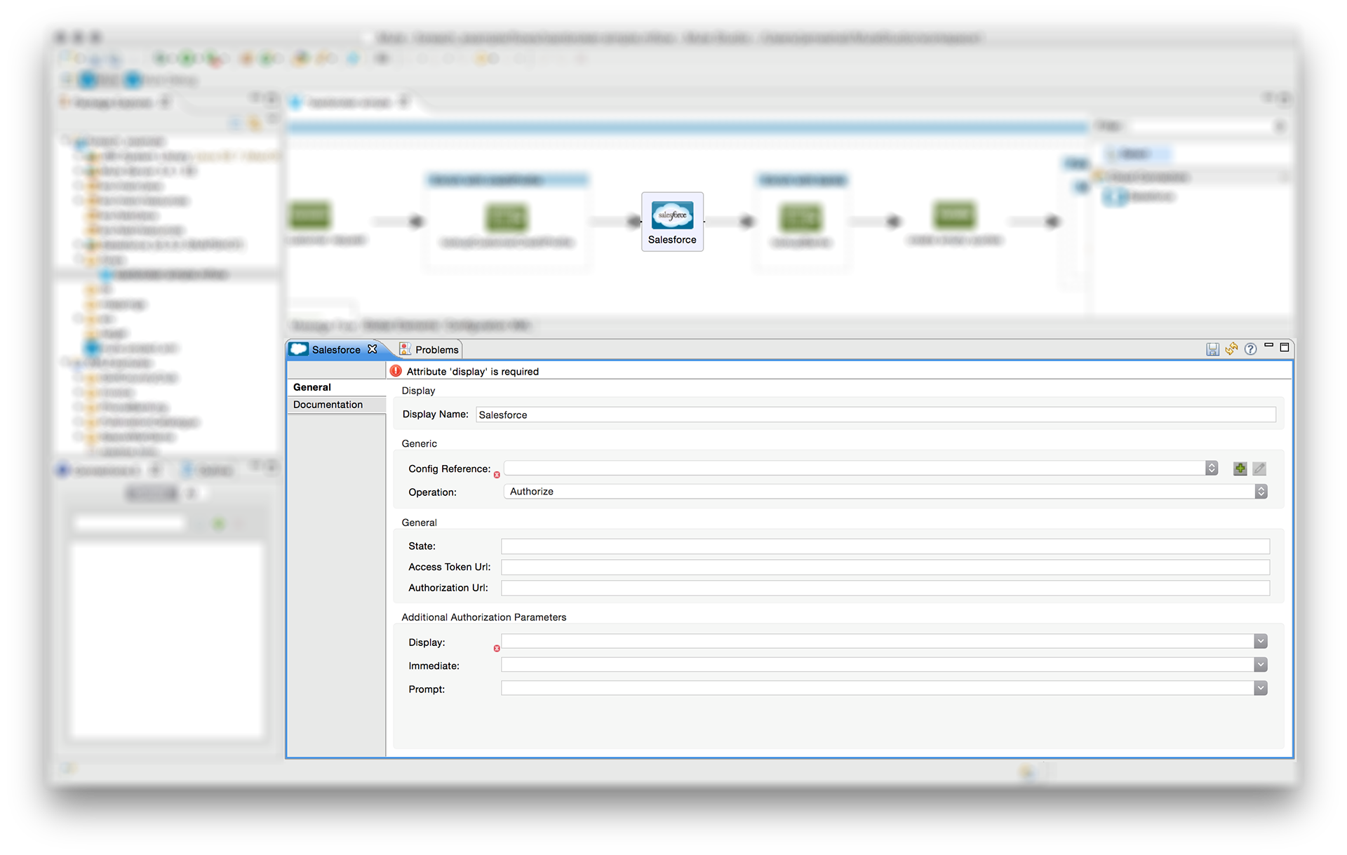
Errors were presented in an illogical way, the first error highlighted related to the 5th step of configuration. Users would begin attempting to rectify an error that likely wouldn't apply to their application. We used this testing insight to restructure the flow to avoid confusing error states.
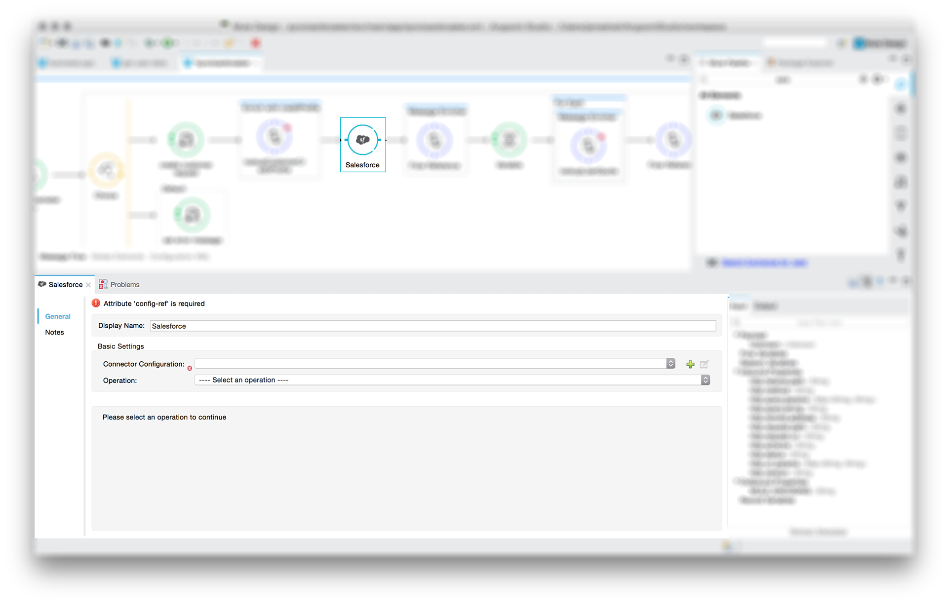
We modified the flow to employ progressive disclosure, and also changed some of the field labels while we were at it. This removed the distracting error and led to a 40% task success improvement in future tests. Now for some audience participation! There are still several serious issues with the previous screen. Take a moment to see which ones you can spot...
Okay, which ones did you spot? My big three are: 1st - Users should never start from an error state. Ideally the red warning icon would be something less threatening, like a lightbulb suggesting an appropriate first step. 2nd - The error refers to a required "config-ref", but there is no "config-ref" field. 3rd - Our progressive disclosure isn't correctly implemented. Before a user successfully configure an operation they must create a connector configuration. All three of these issues are unfortunate issues inherited either from Eclipse (the framework Studio uses) or Mule ESB. I argued for each, but the effort wasn't justified with so many other areas requiring improvement. Did you find any others? Shoot me a note and I'll mail you a gold star.
What I learned: An engineer needs to attend every user test. When they see users encounter friction first hand, they become the biggest catalysts for making product changes (particularly when working with a remote development team).

Phase 2 - Define Solutions
After identifying user experience friction through testing, I got to flex some of my architectural muscles. Architects face the challenge of designing complex, integrated systems that they themselves don’t fully understand. They must work closely with acoustical, structural, mechanical, and electrical engineers as well as interior designers. The architect is required to drive the project forward, but must engage and defer to subject matter experts as appropriate.
Studio has functionality targeting sophisticated Java and Spring developers, which I often didn’t fully understand. I relied on input from the Studio developers, technical sales, support, and professional services teams to formulate solutions that would best serve our users. I would have been far less effective had I been unwilling to admit when I didn’t know the solution to many of the issues we improved.
Here are a few examples of the Studio UX solutions I was able to drive:
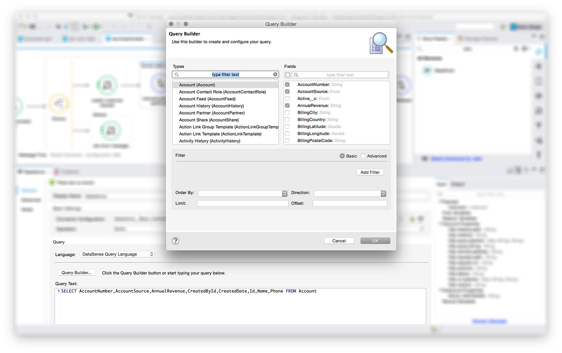
QUERY BUILDER
In 2013 Studio shifted to facilitate SaaS integration (for tools like Salesforce, Workday, and ServiceNow). This direction helped Studio reach a new audience, but also changed the expectations our product needed to deliver against. New users wanted Studio to guide them through configuration, and to limit the amount of knowledge they needed to posses to integrate with a given system.

Creating data queries had proven to be difficult for many of our newer users. Historically, they needed to understand and write SQL (the query protocol supported by the connection APIs) and had to know what the data structure looked like. We created an interface that revealed the structure to the user and helped them to easily pick what data they wanted. Our query builder increased user success by 50% in our tests.
DATABASE DRIVER MANAGMENT
Studio is an Eclipse IDE based tool, which provides a great deal of “free” functionality for software development. Unfortunately, inheriting Eclipse functionality usually means exposing poor interaction models as well. One particularly painful interaction was adding supplementary files to an integration project. When a user desires to integrate with a database, they are required to add a driver to facilitate the connection.

Users were required to perform a string of complex operations, the first of which was buried in a right click menu with a poorly worded title. When user tested, only 20% of novice studio users were able to successfully add a database driver to their project.
We created a new process for adding drivers that is surfaced during the database connection configuration phase of the workflow. It guides the user through a simple process, which resulted in 100% success when the same workflow was retested with users.
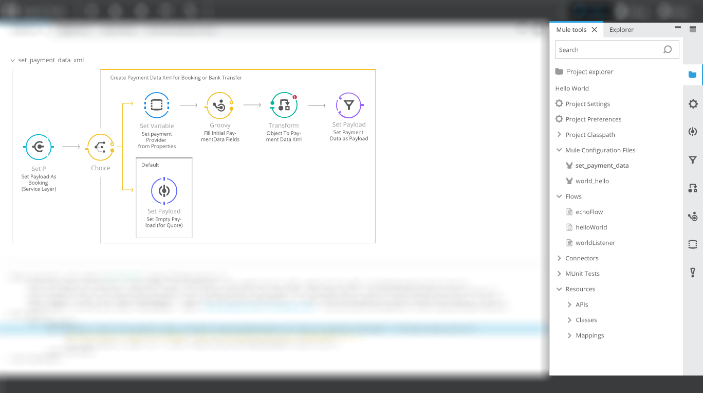
Visual Redesign
After one year of shifting our focus towards generalist developers, I was able to push for approval to execute a visual design overhaul of Studio. The scope included redesigning icons, polishing the UI chrome and layout, as well as a number of interaction improvements. The effort was highly collaborative with the product manager, developers, and UI designers and took over a year to reach completion.

V1 Visual Redesign
V2 Visual Redesign

V3 Visual Design
What I learned: Pick your design battles and use data, not opinions. Designers, product managers, and engineers will inevitably disagree around what the best solution is. I found that a willingness to be flexible on smaller issues allowed me to stand my ground on the big issues, all while preserving a collaborative environment. When consensus was difficult to reach on the big issues, I found data to be much more convincing than all the eloquence I could muster.
PHASE 3 - SHIP IT
As any designer will tell you, designing is the easy part… shipping is where the challenge truly lies. After a few months of iterating on Studio's design, I stepped up efforts to drive excitement about the redesign among the field and engineering teams. I presented to the Product and Engineering leadership which built excitement and solidified the priority of the redesign.
My role shifted partially from design to project management due to team constraints, which was a fascinating new challenge. I kept the team productive, and was also able to present clear scooping and prioritization decisions for the Product Manager. However I could have done a much better job of notifying uninvolved parties about the changes, as well as soliciting support from product leadership when the process encountered friction.
Another milestone in our process was to pull the figurative covers off our plans and share our design enhancements with our customers. I presented to a group of users at MuleSoft Connect 2015, our annual customer conference. We received enthusiastic feedback in favor of our direction, and were able to gather further validation around our priorities.
We were able to ship our first major release of the new design in November of 2015, roughly 14 months after we began the endeavor. Despite wishing for a shorter timeline, the experience helped me learn patience in the implementation process.
What I Learned: It’s not over till the product ships (and then it still isn't over). Due to some release issues with another product, we were given three extra weeks of development time before we had to ship. In those final three weeks we were able to refine and hone the release, as well as add a few small features. I had one feature designed and ready to go, but ended up scrambling to finalize another. In retrospect I would have better prepared
What I Learned: It’s not over till the product ships (and then it still isn't over). Due to some release issues with another product, we were given three extra weeks of development time before we had to ship. In those final three weeks we were able to refine and hone the release, as well as add a few small features. I had one feature designed and ready to go, but ended up scrambling to finalize another. In retrospect I would have better prepared
Phase 4 - Validate
When construction ends on a building, most architects perform a final walk-through, snap a few photographs, and then leave (often never to return again). There is no culture of validating a building’s form or function, largely due to the exorbitant costs of modifying existing buildings. This is one reason I am perpetually grateful to work in software and experience design. I love the opportunity we have to test a product with users, gain insights, and then push those changes back into the product. The rapid feedback loop we have allows us to feel safe testing hypothesis and failing, because we can make the next version even better.
It was thrilling to hear product users thank us for improving some of the interactions they found most irritating. They viewed our product investment as a clear sign that they were important to us as a company, and it sent a strong message. It was also great to hear about the business impact we achieved by hearing technical presales members saying they were no longer frightened to show Studio to prospective customers because it looks much more modern and capable then it previously did.
We have a number of enhancements defined for the product, many of which I hope will be available in the near future. Here are a few that our users hope to see:
Two way Editing
One significant gap in our user lifecycle is the transition between novice “learning” users and advanced “highly efficient” users. Novice users are highly reliant on the graphic view of the project, while advanced users spend the majority of their time writing their integrations using the XML editor. Novice users have frequently mentioned the challenge of learning the XML syntax and properties of Mule projects, as it isn’t visible in the graphic interface mode. I am confident that surfacing both project representations will vastly improve the transition process from novice to advanced user.

Properties View
Studio continues to have space constraints, and always shows information that is of limited use the majority of the time. Studio could have more “micro-modes” in which the displayed information is modified to better serve the current task. The current design always displays a dedicated space for the project file tree, properties of flow elements, and the palette which is not always needed. I created a solution where each can exist in a dynamic pane on the right side of the interface. Users would be able to toggle between the views using tabbed navigation on the side, and the view would modify based on task to show the most relevant information. The experience could be enhanced further by providing a global project search that could surface relevant information at the press of hotkey.

Flow representation
The current project architecture suffers from a few unclear concepts. Users create projects, which contain flow files. Flow files can contain a single flow or batch process, several flows, several batch processes, or any combination of flows, batch processes, or sub-flows. Are you confused yet? I would like to rationalize the project architecture by limiting a single flow per flow file (also simplifying the visual representation into a single “swim lane”) and by creating new file types for batch processes and sub-flows. This would greatly clarify the project navigation and file structure, and would better surface the contents of a project. There are also further visual enhancements to the flow layout that could be made to clarify scopes and message routing.
What I am still learning: We can always do more. At times I felt like we were clearly illustrating the better path forward, yet our product manager would prioritize a low-impact feature that he promised to a customer. Initially I would get very frustrated, which only led to conflict and burnout. While still quick to fight for improvements in our product experience, I’m more willing to let the product roadmap unfold as it needs to. I don’t have perfect information about customer needs and business goals, so I’ve become more willing to trust in the process.