The Problem
Amp had strong engineering and production-quality blockchain data, but no product. No unified strategy, no demo, no clear path to enterprise customers. Leadership hadn't provided strategic direction, and the CTO (my boss) asked me to develop the plan.
The constraints were real: the company needed to demonstrate enterprise traction quickly to support its next phase of growth. Enterprise sales cycles run months to years. Our existing brand had credibility with crypto-native developers but zero enterprise positioning. The marketing team was oriented around Twitter and crypto outreach, not enterprise sales. And critically — no product demo existed for prospects to evaluate.
I needed to simultaneously define what we were building, who we were building it for, and how to get a credible demo in front of enterprise buyers and VCs — all within about 8 weeks, with a single frontend engineer.
My Role
My title was Product Manager, but the work spanned well beyond traditional PM scope. I authored the strategic direction, wrote every product spec, defined the information architecture, set the design direction, and scoped the release. I worked closely with a product designer who translated that direction into polished UI — I set the vision and system-level decisions while he owned the day-to-day execution and visual craft. Together we operated as a two-person product and design team within a six-person platform squad — the rest of the broader organization focused on Amp's core data infrastructure.
This meant I was operating across three registers simultaneously: strategic (where should we bet?), structural (what's the right product architecture?), and experiential (what does a prospect actually see and do?).
Strategic Foundation
Before designing a single screen, I needed to answer two questions: who are we selling to? and what's our actual differentiation?
The Pivot
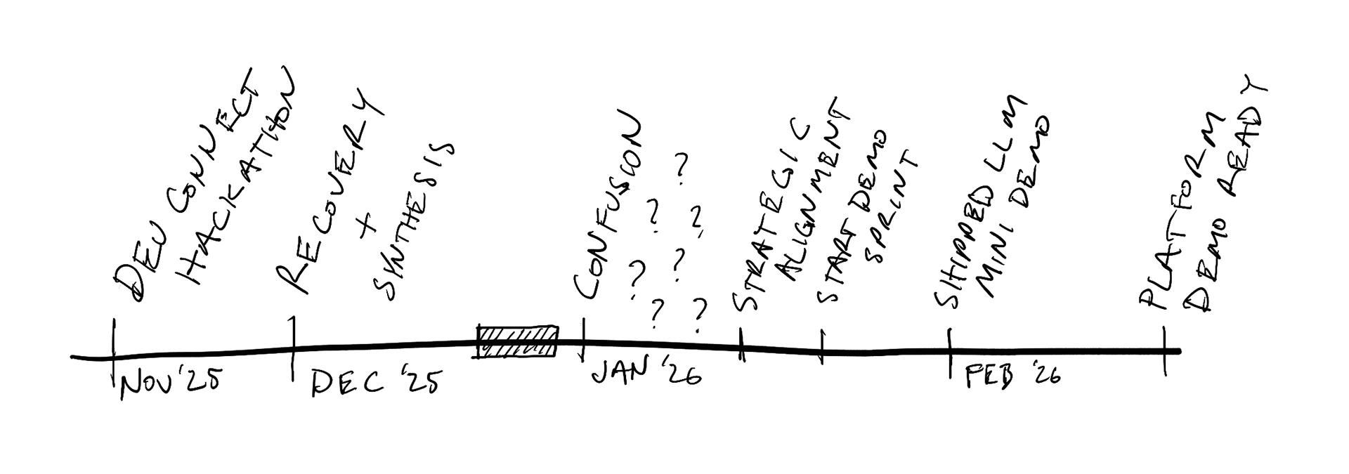
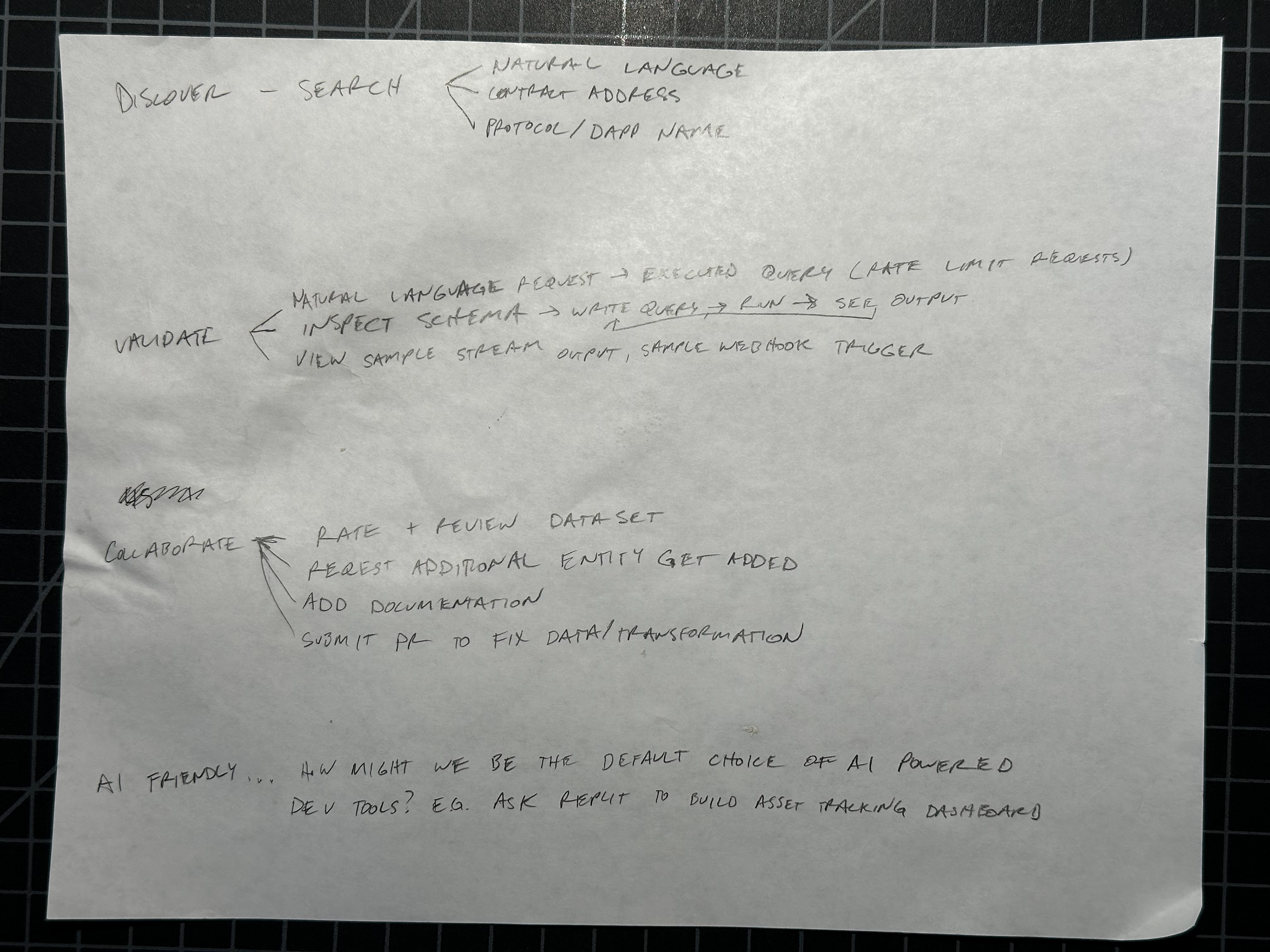
The original vision for the platform was a public SaaS product for application developers — a self-service tool where developers could discover, query, and build on blockchain datasets. I spent significant time researching how to design for network effects: how community contributions, ratings, and shared datasets could create a flywheel that made the platform more valuable as more developers used it. The early sketches reflect this thinking — features like "rate and review dataset," "request additional entity," "submit PR to fix data/transformation," and community bounties for dataset creation.
Devconnect changed that — though not overnight. In November 2025, Devconnect and the ETHGlobal hackathon ran simultaneously in Bangkok. I was interviewing hackathon developers about their data workflows while, in parallel, leadership was having conversations with enterprise prospects that told a very different story. The signal from both sides pointed the same direction, but it took weeks of confusion and synthesis through December before we finalized the enterprise-first focus in January 2026. The developer self-service vision wasn't wrong, but it was premature. Enterprise customers needed the platform now, and they needed a fundamentally different framing: not "explore and contribute" but "evaluate and procure."
I had to let go of months of network-effects thinking and reorient the entire product strategy around enterprise sales. The catalog and playground survived the pivot (both audiences need to discover and query data), but the community layer, the contribution workflows, and the growth-through-network-effects model were all shelved. What replaced them was the dual go-to-market framework below.
Dual-Audience Positioning
The research surfaced a fundamental tension. Amp needed to serve two audiences with completely different mental models:
Analysts — writing SQL, building dashboards, answering questions about on-chain activity. They think in queries and visualizations. They want to explore, iterate, and get answers fast.
Enterprise institutions — evaluating blockchain data infrastructure for compliance, risk, and operational needs. They think in SLAs, audit trails, and governance. They want reliability, provenance, and procurement-friendly packaging.
Same product, different frame. I mapped how every major feature should be positioned differently depending on the audience:
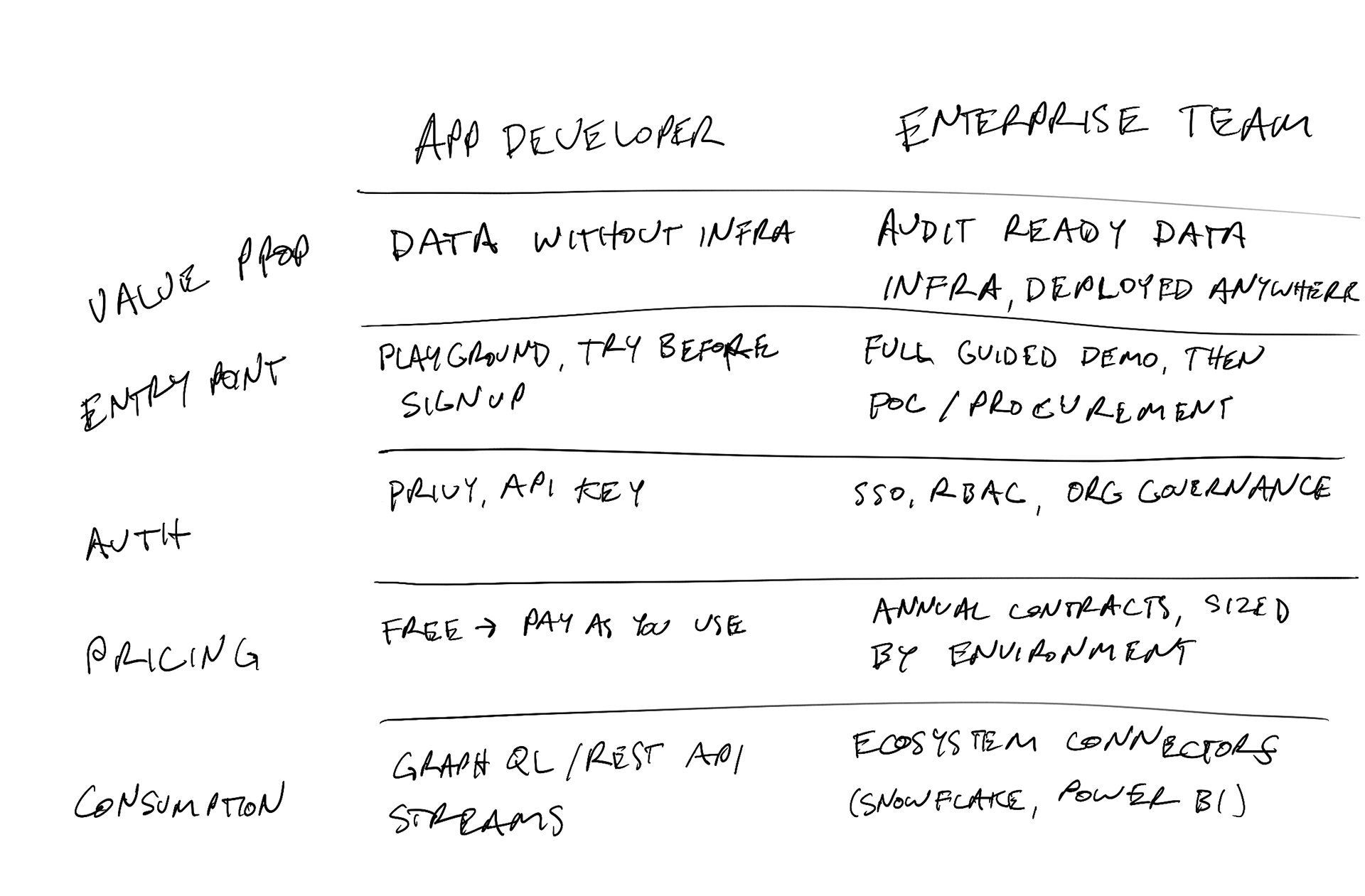
This wasn't just a messaging exercise — it shaped real product decisions. It told us what to build first (the query experience, which serves both audiences) and what to defer (full RBAC, which only enterprise needs on day one).
Scoping the Bet
I authored a strategic direction document for Q1–Q2 2026 that became the team's operating plan. The hardest part wasn't deciding what to build — it was aligning the CFO (cost-conscious), CMO (oriented toward crypto-native marketing), CTO (wanted to build everything), and engineering leadership around a single bet.
The key decisions:
Primary bet: pursue enterprise customers directly, with existing institutional relationships as secondary channels
Enabling work: ship a platform demo in 4–6 weeks — not a full platform
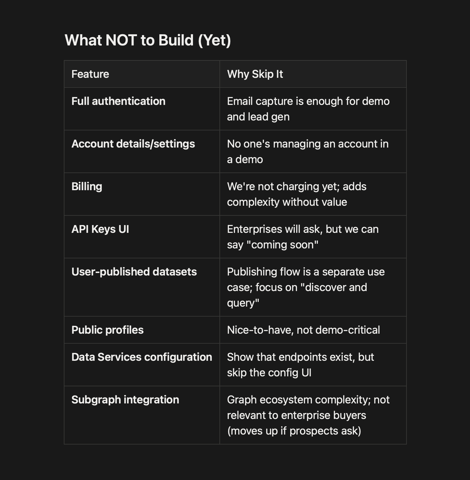
Explicit "what we're NOT doing": billing, full auth, subgraph integration, API key management UI, mobile optimization
That last section — what we're not doing — was the most important part of the document. With limited frontend resources and a tight timeline, every feature we said yes to meant saying no to three others.
Research: Watching Developers Use the Product
Before designing the platform UI, I needed to understand the developer experience we were trying to improve. I mapped the existing subgraph workflow end-to-end — from "new app idea" through smart contract deployment, Graph CLI installation, schema definition, subgraph deployment, and finally querying via the studio playground. Then I mapped the proposed Nozzle flow side by side: the same developer, starting from the same place, but reaching queryable data in a fraction of the steps.

This mapping made the platform's core value proposition viscerally clear: the old workflow required developers to install the Graph CLI, define a schema, map events to entities, deploy, publish, and then test queries. The new flow let them query events via SQL almost immediately. It's also where the playground-first architecture decision took root — the SQL query step was the moment developers went from "setting up infrastructure" to "getting value from data."
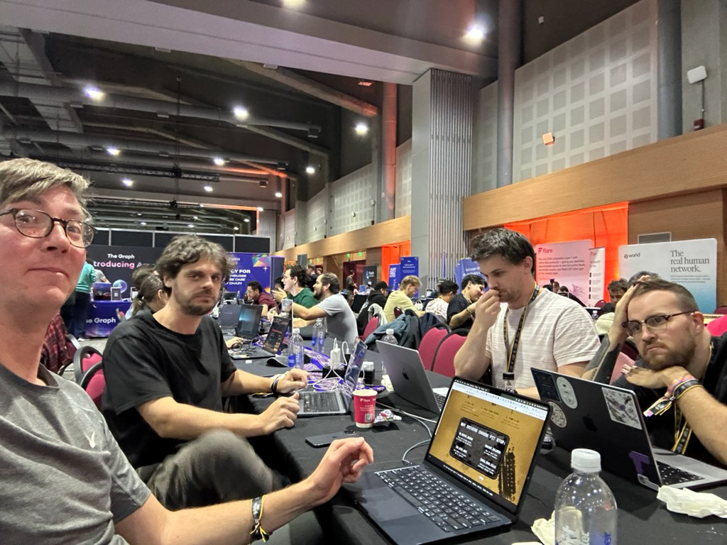
At the ETHGlobal hackathon in November 2025 — running alongside Devconnect in Bangkok — I had a chance to validate this mapping against real developer behavior. I spent time interviewing developers who had just used Amp's core experience — querying datasets, working with the local tooling, and building on the data.
These weren't hypothetical user interviews. These were people who had just spent hours building with the product under real conditions, and their feedback was immediate and specific. Two insights shaped everything that followed:
First, the playground was the unlock. Developers who could query data directly — seeing real results come back from real blockchain datasets — understood the value proposition almost instantly. The ones who had to read documentation or set up local environments first often stalled. This confirmed that an interactive query experience needed to be the centerpiece of the platform, not a secondary feature.
Second, discoverability mattered more than we expected. Developers kept asking variations of "what datasets do you have?" and "is there data for [specific protocol]?" The dataset registry wasn't just an organizational convenience — it was the primary way users would evaluate whether Amp was useful for their specific problem. This pushed the catalog from "nice to have" to "the front door."
Designing the Platform
The demo architecture was deliberately simple: Datasets → Dataset Detail → Playground. Everything else was post-demo. Here's how I designed each piece, and the decisions that shaped them.
Dataset Catalog
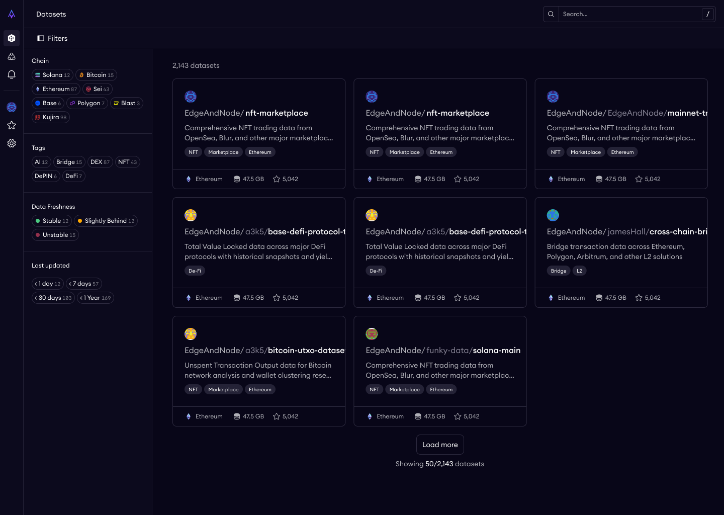
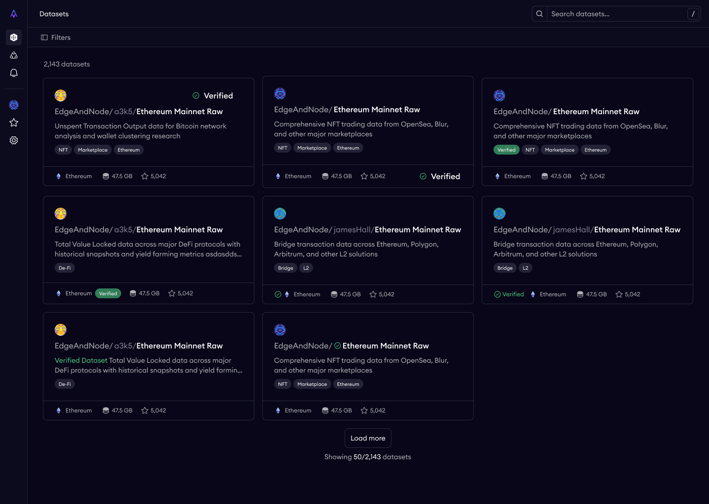
The catalog is the front door — the first thing any prospect sees. I made two early decisions that set the tone for the entire platform.
Public and unauthenticated. No login required to browse. This was a deliberate friction-reduction choice. Enterprise evaluators want to poke around before committing to a sales conversation. Developers want to see what's available before signing up. The catalog needed to serve both by letting anyone explore freely.
Search by protocol, chain, tags, keyword. Blockchain data users have strong domain-specific mental models — they think in terms of chains (Ethereum, Solana) and data categories (DEX trades, token transfers, NFT activity). The information architecture mirrors how practitioners actually think about blockchain data, not how our database happens to organize it.
Dataset Detail Page
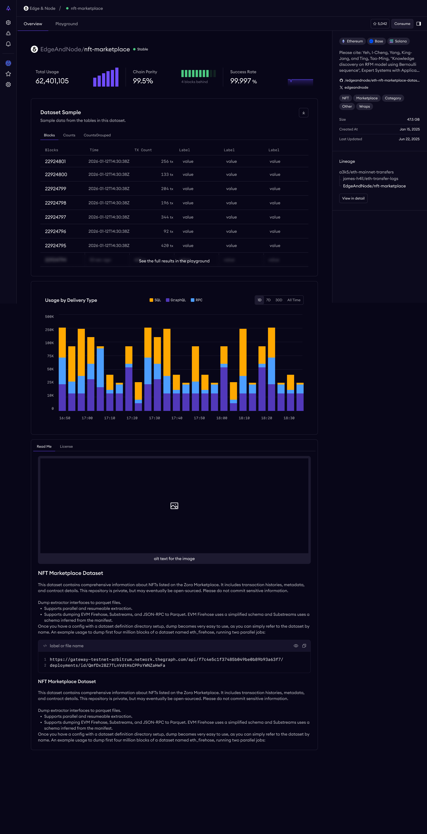
Each dataset gets a "product page" — the place where a prospect decides whether this data is worth querying. I designed it with four key sections:
Overview — name, description, chain coverage, freshness, row count, publisher. The basics, scannable in seconds.
Status & Verifiability — this is where Amp's core differentiator lives. A verification badge with a tooltip explaining what it means (block headers, transaction data, and event logs cryptographically checked at every block during ingestion to ensure all entries are present and correctly ordered). Dataset status (Production/Beta). SLA and freshness targets.
Documentation — schema with tables, columns, types, and descriptions. Example queries with copy-to-clipboard. Caveats and limitations listed honestly.
Basic Lineage — data source chain, transformation summary. I deliberately kept this as structured text for v1 rather than a visual DAG — the engineering cost of an interactive lineage visualization wasn't justified for the demo, and well-written text actually communicates provenance more clearly for most users.
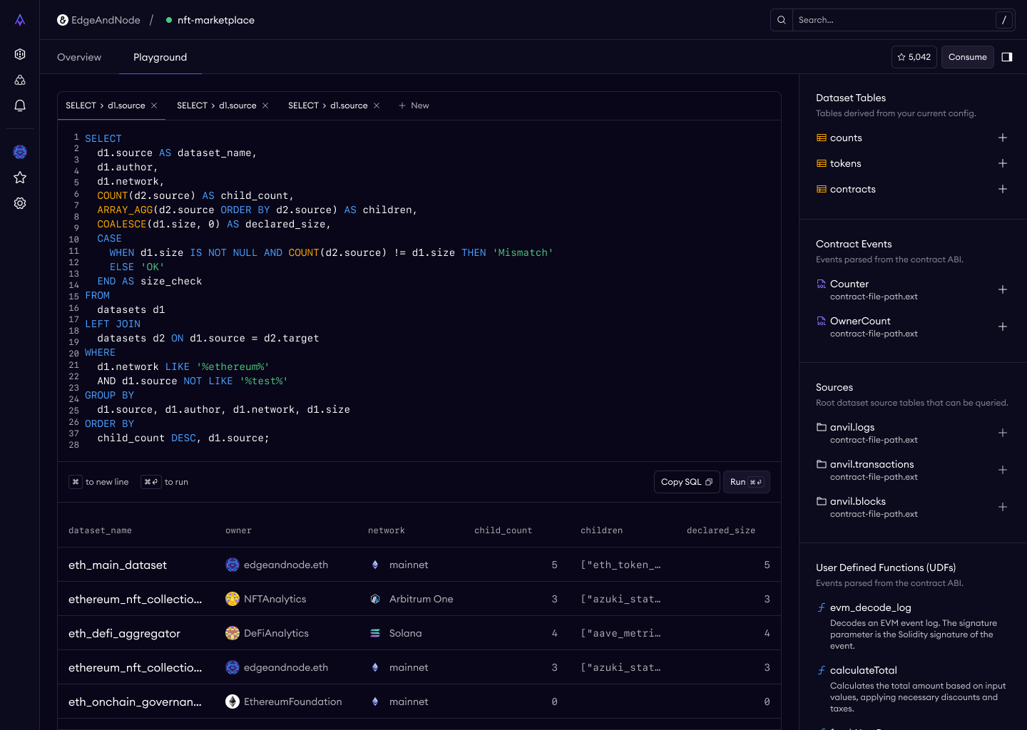
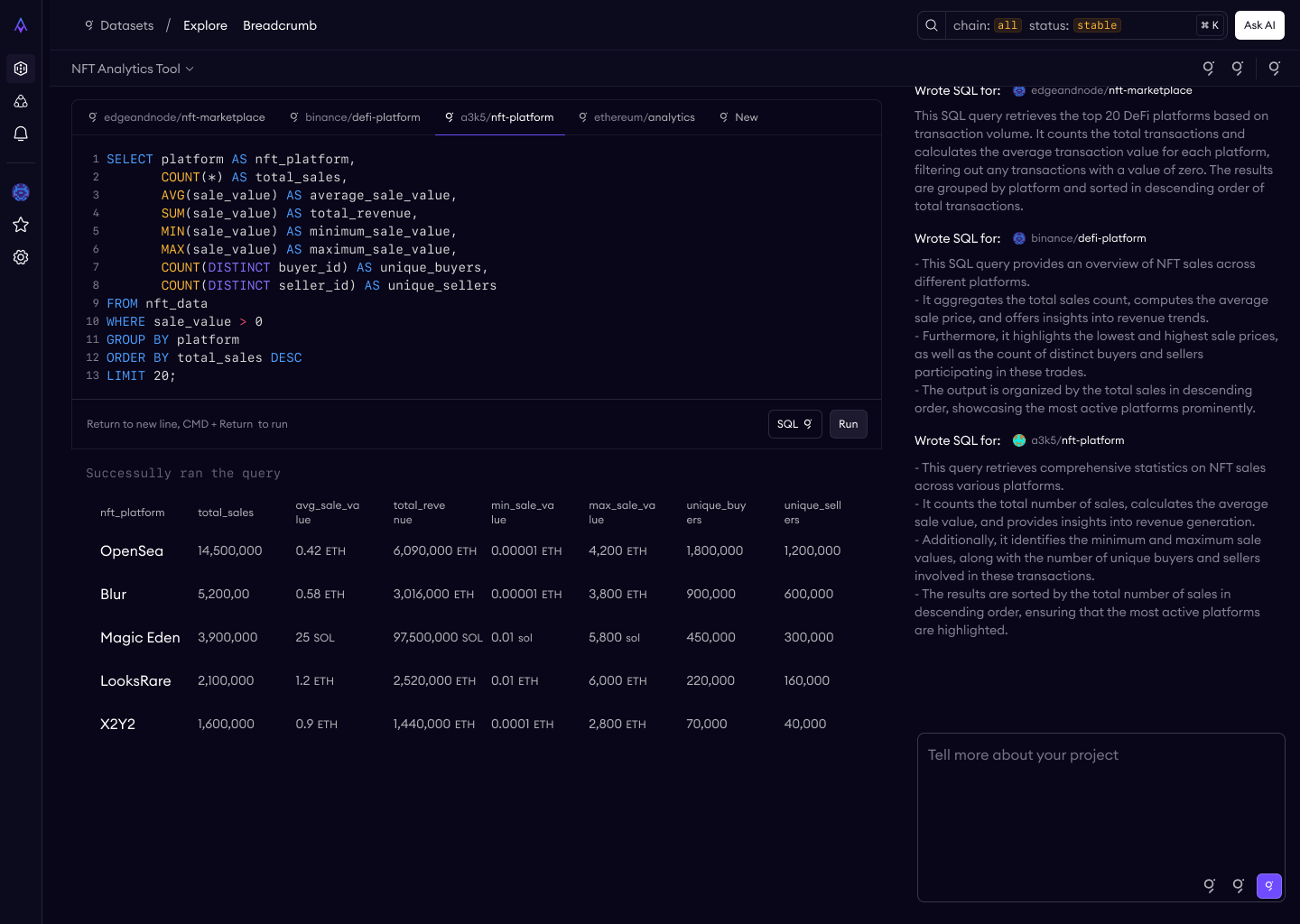
SQL Playground
This is the "aha moment" — where a prospect queries real production blockchain data and sees results come back verified.
Pre-populated example queries. Every dataset ships with a working example query already loaded in the editor. This eliminates the cold-start problem — users don't have to know SQL syntax for this specific schema to experience the product. They can just hit "Run" and see data.
Verification visible alongside results. A green checkmark and "Verified" badge appears in the results area, with a tooltip: "Results are from data cryptographically verified at ingestion." The differentiator is always visible, never buried.
Error handling as design. I specified three tiers: syntax errors (inline highlighting in the editor), execution errors (clear error panel with actionable messages), and timeouts (suggestion to add LIMIT clauses). Bad error messages in a data tool erode trust faster than almost anything else.
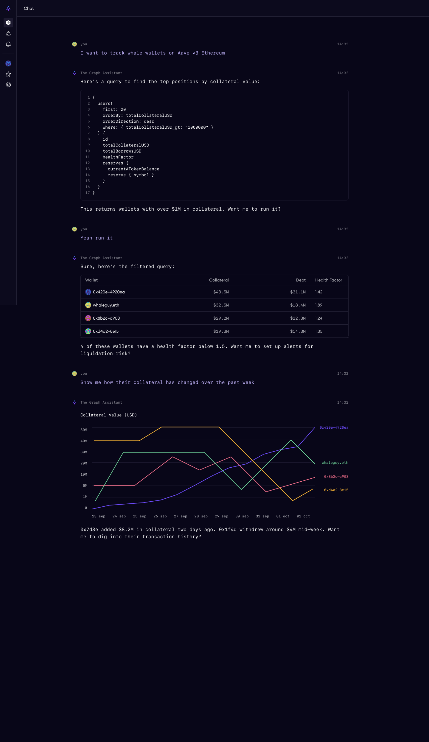
The Hardest Design Problem: LLM-Assisted Answers
The most complex feature in the demo was "Ask AI" — a natural language interface where users ask questions about blockchain data and the system generates SQL, executes it, and shows results. This is the feature that would differentiate us in live demos and make the platform feel genuinely next-generation.
v1: Too Simple
My first concept was straightforward: a text input in the playground, user asks a question, system generates SQL, user reviews and runs it. But this fell apart quickly in edge cases. What if the question is ambiguous? What if it spans multiple datasets? What happens to the generated SQL after the user moves on?
v2: Chat as Workspace Orchestrator
The breakthrough was reframing the AI interface not as a feature within the playground, but as an orchestrator of the entire workspace. I worked with our designer to generate an approach that would guide the user real-time through the platform.
Every AI action — selecting a dataset, writing a query, showing results — appears as a clickable step in the chat that navigates the main workspace view. The user always sees what the AI is doing and can jump to any step.
Why This Was Hard
The tension was between "wow factor" and trust. An AI that instantly generates SQL and shows answers is impressive in a demo. But enterprise buyers — the primary audience — need to trust the system. They need to see exactly what query was run, verify the logic, and understand the provenance of the results.
The chat-as-orchestrator model resolved this by making every step inspectable. The AI never feels like a black box because every action it takes is visible, clickable, and reversible. This is the design equivalent of "don't trust, verify" — applied to the AI itself.
Verification: Designing Around an Honest Claim
One of the most important design problems wasn't about UI at all — it was about integrity.
Early marketing content described Amp's verification as "cryptographic proofs" and "trustless verification," implying something comparable to zero-knowledge proofs at query time. When I audited a conference talk submission, I found it overclaimed. What Amp actually does is cryptographically verify data at ingestion — block headers, transaction data, and event logs are checked at every block to ensure all entries are present and correctly ordered in the extracted tables. This establishes a root of trust at the data boundary. It happens once, at ingestion, not on every query.
This is genuinely meaningful, but it's different from per-query ZK proofs. And critically, it's only half the story enterprises care about. I worked with the team to reframe the positioning around a two-layer trust model:
Layer 1: Verifiable extraction — cryptographic verification at ingestion proves raw chain data is valid when it enters the system.
Layer 2: Enterprise governance — once data crosses into an enterprise's infrastructure, traditional controls take over: RBAC, immutable audit trails, version-controlled dataset definitions, and complete lineage from verified source through every transformation to final API.
We landed on: "Cryptographically verified at ingestion, governed thereafter" — which was more honest and more compelling for the actual buyer. Auditors and regulators don't verify ZK proofs — they review access logs, change management processes, and data lineage documentation. Framing the product around how enterprises actually demonstrate compliance was a stronger pitch than overclaiming cryptographic capabilities.
The verification badge in the UI reflects this precision — it communicates that the underlying data was verified at ingestion without implying per-query cryptographic proofs.
Systems Thinking: The Architecture Beneath the Screens
Several design decisions required thinking about systems that wouldn't be visible in the demo but would determine whether the product could scale.
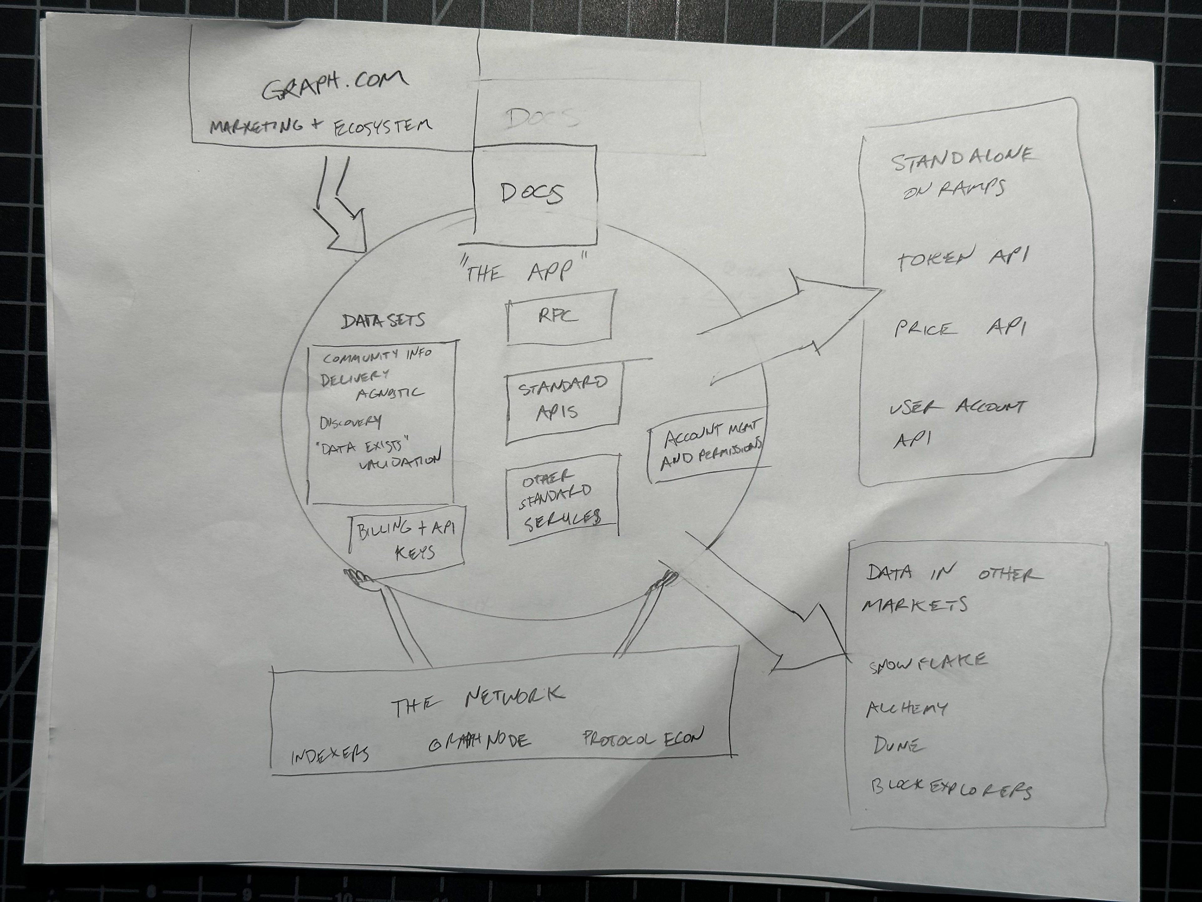
Information Architecture
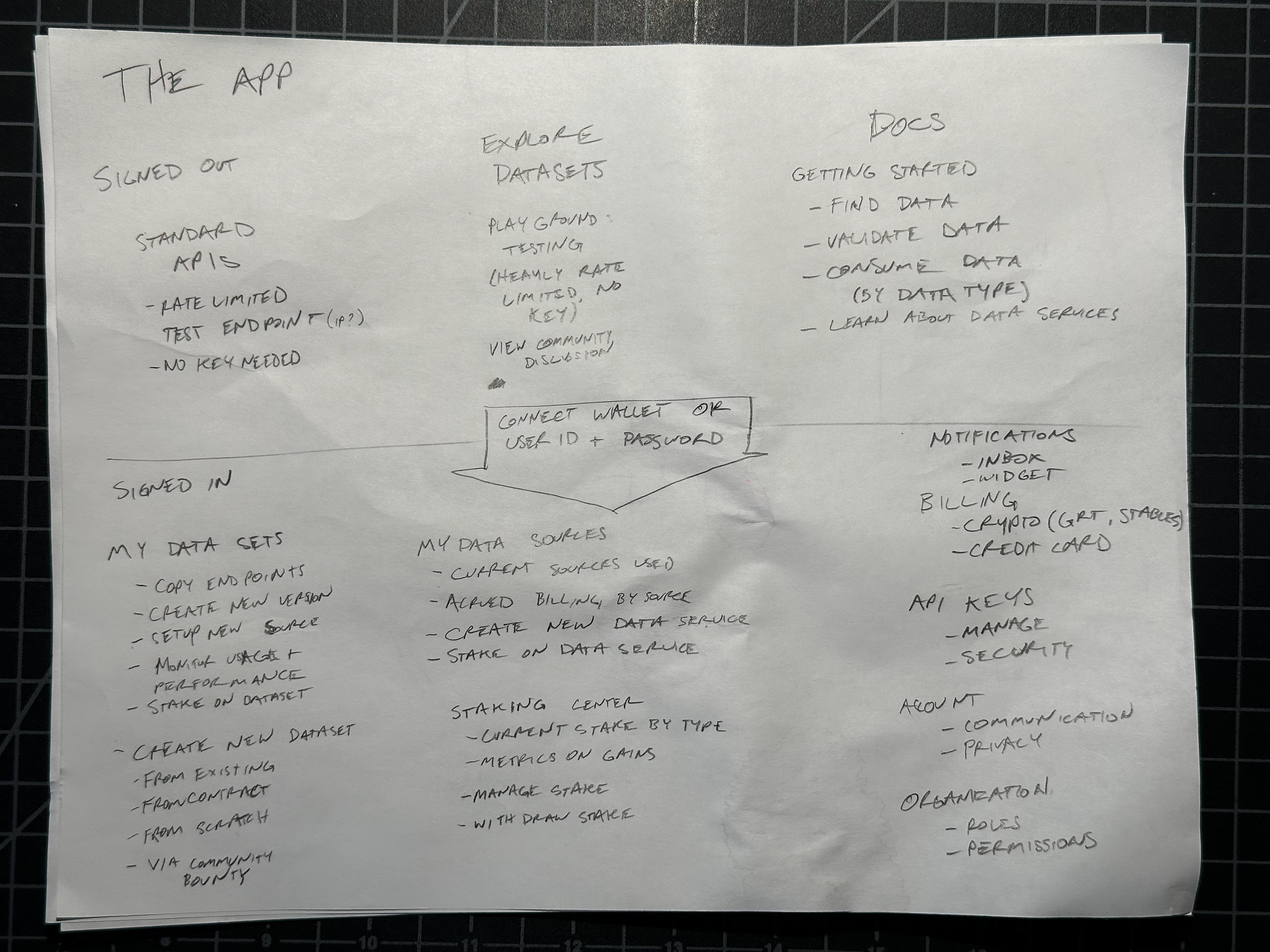
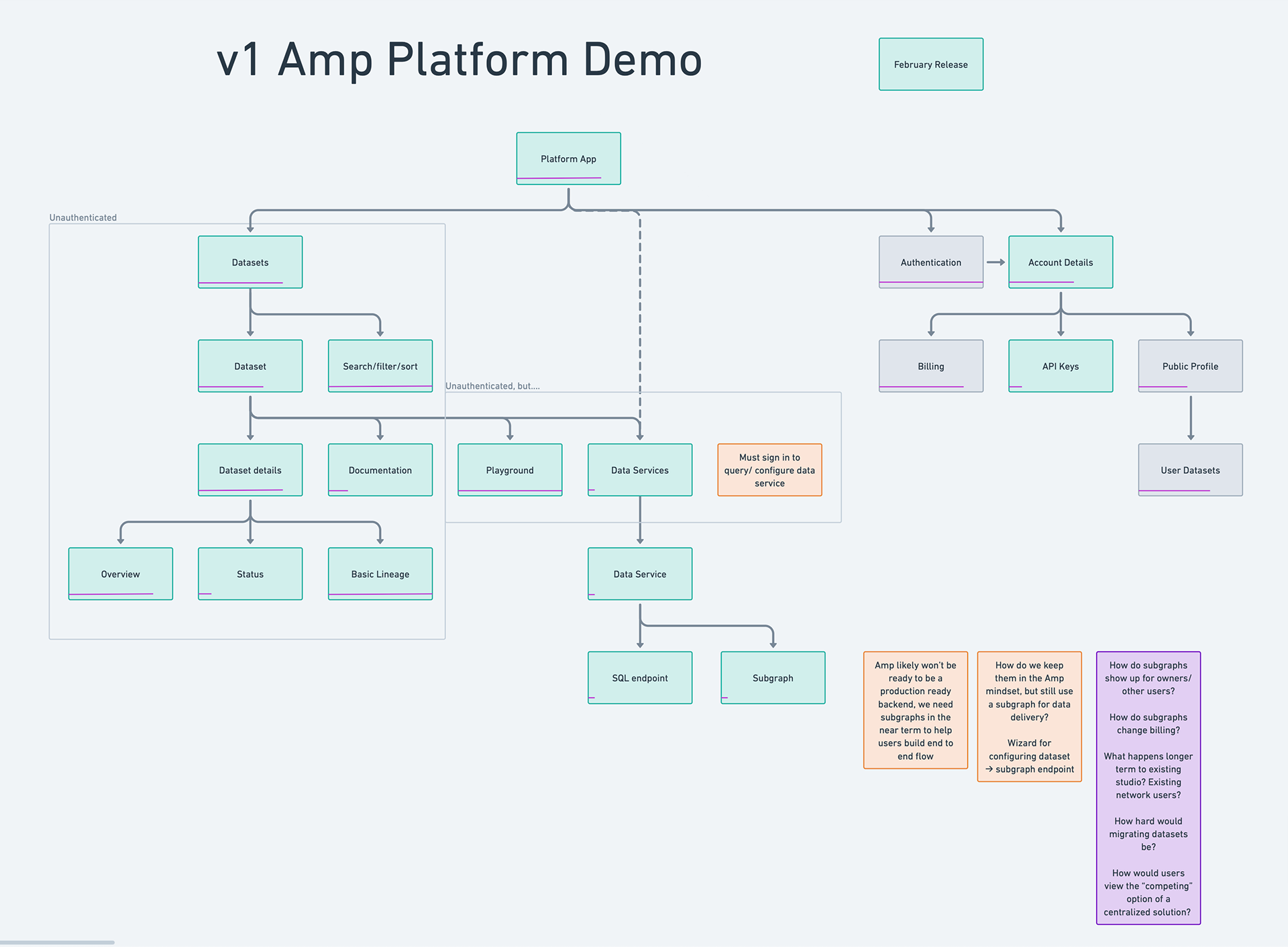
Before designing any screens, I needed to define the system's bones. The early IA mapped every page, every route, every relationship — solid lines for v1, dashed boxes for what could wait.
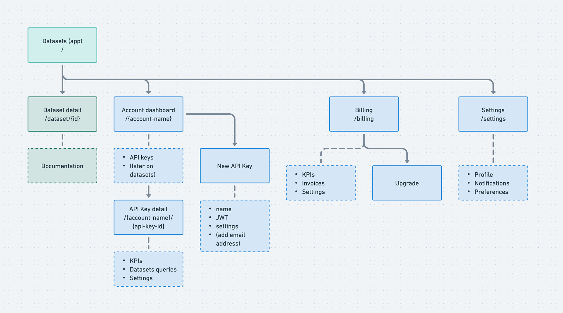
What this diagram reveals is the fundamental split that drove the entire platform architecture: the left side (Datasets → Dataset detail → Documentation) is public and unauthenticated. The right side (Account dashboard → API keys → Billing → Settings) is private and gated. The auth boundary runs right down the middle. Every design decision about where to place the email gate, what to show signed-out users, and how to structure the demo flow traces back to this split.
The IA also shows scope discipline. Dashed boxes (Documentation, KPIs, Invoices, Upgrade, Notifications, Preferences) are real features that real users will need — but none of them were required for the demo. Distinguishing "needed eventually" from "needed now" in a diagram like this gave the team a shared artifact to reference when scope conversations got contentious.
Organizational Hierarchy
How should accounts work for both a solo developer and an enterprise team with SSO, multiple teams, and compliance requirements?
I explored three approaches:
Two-tier (User → Workspace): too simple for enterprise — no isolation between teams, no org-level billing
Three-tier with "Workspace" as middle entity: naming was confusing and overloaded — "workspace" means different things to different users
Three-tier with clear entities (Organization → Team → Project): maps to established patterns from GitHub, dbt Cloud, and Terraform Cloud
I landed on the third option: Organizations own billing, SSO, and org-wide policies. Teams provide isolation boundaries, API keys, and resource ownership. Projects are logical groupings with no RBAC (explicitly deferred until enterprise demand proves it's needed).
The early IA shows a simpler account model (Account dashboard → API keys, with Billing and Settings as siblings). The org hierarchy evolved from here as enterprise requirements became clearer — another example of the architecture responding to the pivot.
What I Learned
Scoping is the hardest design skill. With unlimited time, every feature I deferred would have made the product better. But shipping a focused demo in 8 weeks taught more about our users and our market than 6 months of building the "complete" platform would have. The explicit "what we're NOT doing" section forced clarity that benefited every subsequent decision.
Talk to users at the moment of experience. The ETHGlobal interviews shaped this project more than any competitive analysis or internal brainstorm. Watching developers use the product — and hearing what confused, delighted, or blocked them — gave me conviction about where to invest limited design and engineering resources. The playground-first architecture and the catalog as front door both came directly from those conversations.
Know when to kill your vision. I spent real time designing for network effects — community contributions, dataset ratings, collaborative workflows. Devconnect told us that wasn't the right bet yet. Letting go of that work wasn't easy, but the features that survived the pivot (the catalog, the playground) were stronger for being pressure-tested against a different audience. Good design research doesn't always confirm your direction — sometimes it redirects it entirely.
Honest positioning is better positioning. Reframing verification from overclaimed "trustless proofs" to accurate "verified at ingestion, governed thereafter" didn't weaken the story — it made it more credible to the audience that actually matters (enterprise buyers whose auditors review access logs and lineage documentation, not ZK proofs).
Design decisions are product decisions. In a small team with tight scope and limited frontend resources, every UI choice is also a prioritization choice, a scope choice, and a go-to-market choice. The organizational hierarchy wasn't just an account settings page — it determined how billing works, how API keys are scoped, and how enterprise SSO integrates. Designing these systems requires thinking in connections, not screens.